What Are the Dimensions of Album Artwork a Complete Guide
What are the dimensions of album artwork for Spotify, Apple Music, and vinyl? Get perfect sizing for streaming and print with our definitive guide.
January 22, 2026
Music Marketplace Advisor
Buying & SellingWhen you're getting ready to release your music on platforms like Spotify or Apple Music, there's a magic number to remember for your album art: 3000 x 3000 pixels.
That perfect square is the gold standard. It guarantees your artwork looks sharp and professional, whether someone's looking at it on a giant monitor or just glancing at their phone.
Why Your Album Artwork Dimensions Matter
Think about it: in a sea of digital music, your cover art is the very first thing that grabs someone's attention. It's like a book cover in a massive online library. A crisp, compelling image makes people want to click and listen. A blurry, pixelated one? That might make them assume the music is just as amateur.
Getting these technical specs right isn't just a tiny detail anymore—it's absolutely critical for making a solid first impression. Mastering these requirements ensures your music looks as good as it sounds, everywhere it's played.
The First Impression Is Visual
Long before anyone hears a single note, they see your artwork. That single image has to set the tone, hint at the genre, and communicate who you are as an artist. A great cover does all that heavy lifting in a fraction of a second, making it far more likely that a potential fan will hit "play."
Your cover art isn't just packaging; it's your lead salesperson in a visual world. It’s out there 24/7, fighting for attention in crowded playlists, search results, and social media feeds.
Ignoring the technical rules can cause real headaches, too. If your artwork is too small, it'll look fuzzy and unprofessional. If it isn't a perfect square, streaming services will force it to fit by either stretching it or awkwardly cropping it, which could cut off your name or a key part of the design.
Building a Cohesive Brand
Consistency is key. When you use a consistent visual style across all your releases, fans start to recognize your work instantly. Sticking to the right dimensions is the foundation for building that polished, recognizable catalog.
This isn't just about looking good, either. It sends a clear message to listeners, playlist curators, and even industry pros that you are serious about your music. For a deeper look at this, our guide on why artists should invest in quality cover art breaks down how a strong visual identity can make all the difference.
Ultimately, knowing the right dimensions for your album artwork is about taking control of your art. It ensures your creative vision shows up exactly how you imagined it—no distortion, no compromises—on every single platform.
Mastering Digital Artwork for Streaming Platforms
Trying to figure out the technical specs for digital distributors can feel like you're trying to crack a secret code. Every platform has its own rulebook, but they all share the same goal: making sure every song looks clean, professional, and consistent for millions of listeners. Nailing these details is that final, crucial step between your finished track and a successful release.
Think of your digital distributor as a gatekeeper. They’re the ones who take your music and its visual companion—your artwork—and deliver it to Spotify, Apple Music, and all the others. To do that smoothly, they have to enforce some pretty strict guidelines. If your artwork file doesn’t meet their standards, it gets kicked back, and your entire release gets delayed.
This isn’t about limiting your creativity; it’s all about standardization. A perfect square image will show up correctly everywhere, from a tiny playlist thumbnail on a watch to a full-screen display on a smart TV. Sticking to these specs guarantees your vision stays intact, without any weird cropping or blurry, upscaled messes.
This image sums up the three pillars of great album art for streaming: the right dimensions, high quality, and visual impact.
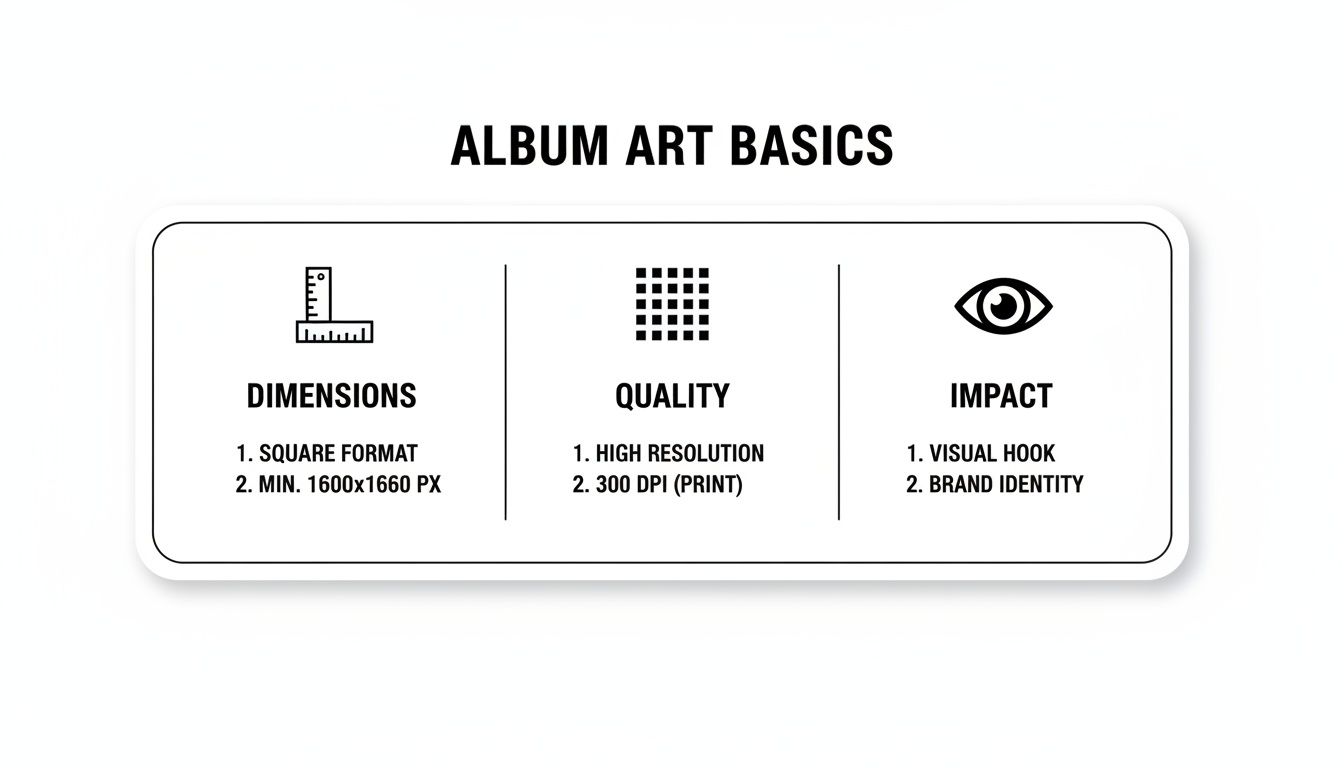
Get these three things right, and your artwork will be both technically compliant and visually powerful, setting you up for a pro-level release.
Spotify: The Industry Standard
Spotify is the undisputed giant in music streaming, which means its guidelines have basically become the industry standard. The good news? If you optimize your artwork for Spotify, it will likely be accepted almost everywhere else with few, if any, changes.
Here’s what you need to know:
- The platform demands a perfect 1:1 square aspect ratio. This one is non-negotiable.
- For the best possible quality, aim for at least 3000 x 3000 pixels. While some distributors might accept a minimum of 1600 x 1600 pixels, going bigger ensures your art looks sharp on high-definition screens.
- Your file format matters. Spotify accepts JPG, PNG, or TIFF files.
- The color mode must be sRGB. This is the standard for all digital screens. If you use a different color mode like CMYK (which is for printing), your colors will look dull and wrong once they’re uploaded.
Apple Music and Amazon Music: Aligned Specs
Following right behind Spotify, Apple Music and Amazon Music have very similar technical requirements, which makes things a lot easier for artists. Just like Spotify, both platforms require a perfect square with a 1:1 aspect ratio.
They also recommend a dimension of 3000 x 3000 pixels. This consistency across the top three platforms really streamlines the design process. You can create one master file that works perfectly for the huge majority of your potential listeners.
The uniformity in artwork specifications across major platforms is a huge benefit for independent artists. It allows them to focus on creating one high-impact image that works everywhere, without needing platform-specific variations.
Both services also require the sRGB color space and accept JPG or PNG files. Keeping an eye on your file size is also important; while many don't list a hard cap, keeping it under 10 MB is a good rule of thumb to ensure it loads quickly for users. This balance between high resolution and a manageable file size is a key technical hurdle to clear. After all, you need to understand why music streaming platforms are crucial for exposure to get the most out of them.
Tidal and Other High-Fidelity Platforms
For platforms that pride themselves on high-fidelity audio, like Tidal, the visual standards are just as high. While Tidal's core requirements line up with the others—a 1:1 square aspect ratio, JPG or PNG format, and sRGB color mode—they are especially strict about image quality.
Submitting an image smaller than 1600 x 1600 pixels will almost certainly be rejected. Given their focus on a premium user experience, any hint of pixelation or blurriness just won't fly. That’s why you should always export your artwork at the highest possible resolution, 3000 x 3000 pixels, just to be safe.
A Quick-Reference Guide
To make things even simpler, here's a table that breaks down the essential artwork requirements for the major streaming services. It's a great cheat sheet to have on hand whenever you're prepping a release.
Digital Streaming Platform Artwork Specifications
| Platform | Minimum Dimensions (Pixels) | Recommended Dimensions (Pixels) | Aspect Ratio | Accepted File Formats | Color Mode | Maximum File Size |
|---|---|---|---|---|---|---|
| Spotify | 1600 x 1600 | 3000 x 3000 | 1:1 (Square) | JPG, PNG, TIFF | sRGB | Under 4 MB |
| Apple Music | 3000 x 3000 | 3000 x 3000 | 1:1 (Square) | JPG, PNG | sRGB | Not specified (under 10 MB is safe) |
| Amazon Music | 1600 x 1600 | 3000 x 3000 | 1:1 (Square) | JPG, PNG | sRGB | Under 10 MB |
| Tidal | 1600 x 1600 | 3000 x 3000 | 1:1 (Square) | JPG, PNG | sRGB | Under 10 MB |
| Pandora | 3000 x 3000 | 3000 x 3000 | 1:1 (Square) | JPG, PNG | sRGB | Under 10 MB |
By following these guidelines, you're doing more than just checking a box. You're ensuring your artwork not only meets the technical specs for distribution but also presents your music in the best possible light. This kind of technical diligence is a mark of professionalism that helps you stand out.
Artwork Dimensions for Vinyl and CD Releases
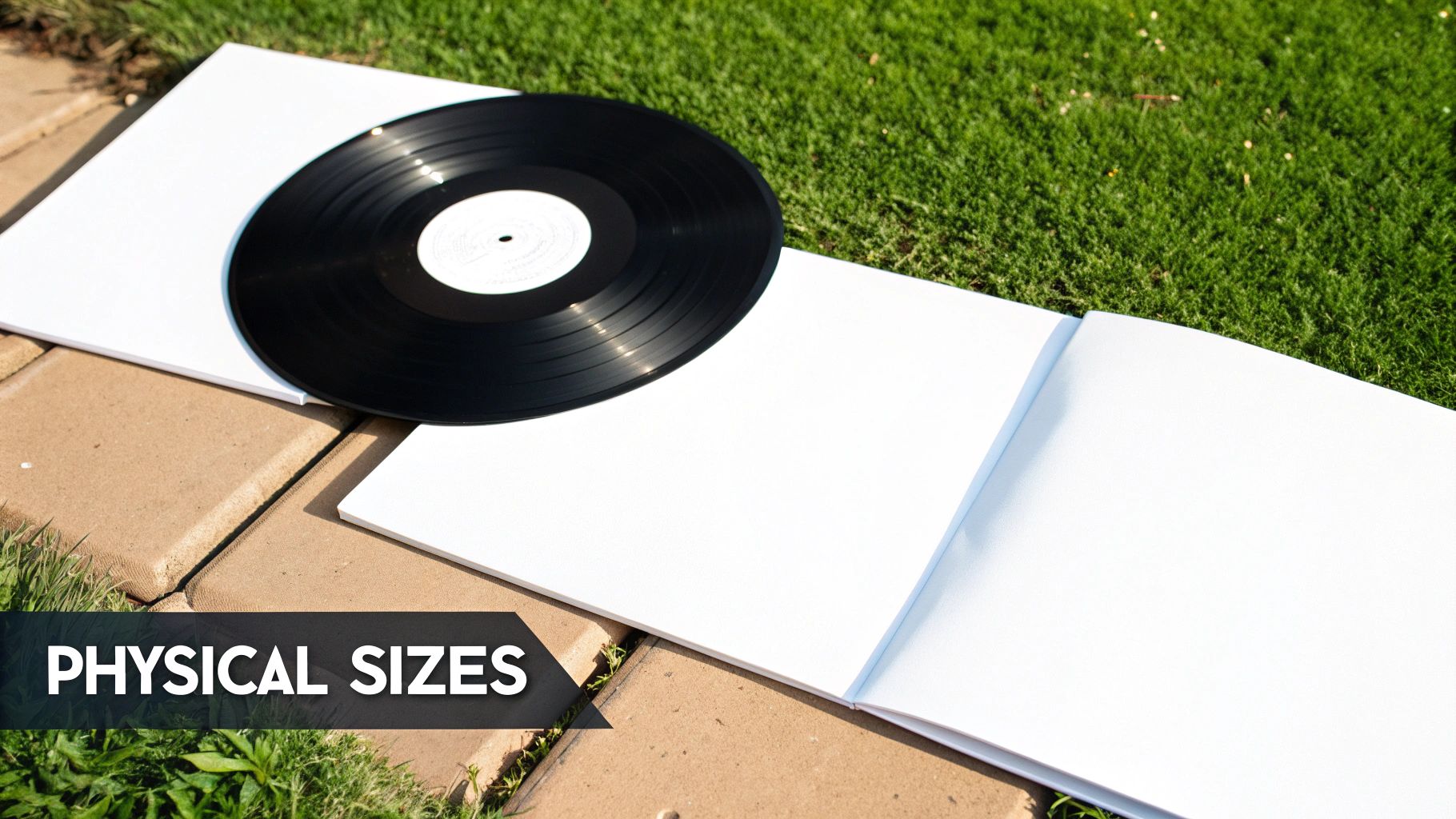
While streaming may rule the charts, the pull of physical media is stronger than ever. For so many fans, holding a vinyl record or CD isn't just about the music—it's about owning a tangible piece of art. This is where the artwork becomes a much larger, more immersive canvas than a tiny square on a screen.
This comeback isn't just about nostalgia. It’s a statement. A thoughtfully designed physical release becomes a coveted collector's item, forging a much deeper connection between an artist and their audience. The first step to creating that artifact is nailing the exact dimensions.
The Iconic 12-Inch Vinyl LP
Nothing beats the vinyl LP sleeve. It's the most celebrated format for album art in music history for a reason. That big, square canvas gives you incredible room for stunning visuals, detailed liner notes, and creative packaging that you just can't replicate digitally. When you’re prepping a design for a standard 12-inch LP, precision is absolutely critical.
Vinyl album cover dimensions were standardized back in the 1950s at a precise 12.375 × 12.375 inches (31.43 × 31.43 cm). This shift was a game-changer, turning album art into a cultural force that could boost sales by up to 800%. Compare that to the plain paper sleeves of old 78 RPMs, or the massive 80% reduction in canvas size when CDs took over in the 80s, shrinking the art to under 5 × 5 inches.
Here are the key measurements you'll need:
- Standard Sleeve: Your front and back cover designs should be 12.375 x 12.375 inches. This includes a small overage that gets folded and glued during manufacturing.
- Spine: The edge of the sleeve usually measures about 0.25 inches, but this can change depending on the record's thickness.
- Bleed Area: Every printer needs a "bleed," which is an extra margin of about 0.125 inches on all sides. This simple step prevents any ugly white edges from showing up if the cutting machine is off by a hair.
Designing for vinyl is like creating a poster. You have to think about how the image wraps around the sleeve, what the spine text looks like on a shelf, and how inserts or gatefolds tell a story as the listener unfolds them.
To get that perfect, professional finish on your physical release, you have to get the print-ready files right. Mastering these details is crucial, and checking out a guide to mastering pixel dimensions for perfect print quality can be a massive help.
The Compact Disc Jewel Case and Digipak
The CD brought music into the digital age and came with its own set of design rules. It may be smaller than a vinyl sleeve, but the multi-page booklet in a standard jewel case gives you a fantastic opportunity to tell a story through a sequence of images and text.
A standard jewel case is made of several parts, and each one needs artwork with precise dimensions. Getting these right is the difference between a professional product and a sloppy-looking one that doesn't fit together.
Key CD Artwork Dimensions:
- Front Booklet/Cover: This is your main cover art, measuring 4.724 x 4.724 inches (120mm x 120mm).
- Tray Card (Back Cover): This piece sits behind the clear CD tray. It measures 5.9 x 4.6 inches (150mm x 118mm) and includes the two spines.
- Spines: Each spine on the tray card is about 0.25 inches thick—just enough room for the artist and album title.
The Digipak is a popular alternative to the classic plastic jewel case. It's a printed cardboard package with a plastic tray glued inside, giving it a more premium and eco-friendly feel. Best of all, it offers a larger, continuous surface for your art when unfolded, almost like a miniature vinyl gatefold. Dimensions can vary, so always double-check the exact specs with your manufacturer before you start designing.
How to Export Your Artwork for a Perfect Finish
So you’ve poured your heart and soul into creating stunning album artwork. That’s a huge accomplishment, but it's only half the battle. Now comes the final, critical step: exporting it with the right technical settings. This is where your creative vision meets the nuts and bolts of digital and print production.
Think of it like a chef meticulously plating a dish. The ingredients can be perfect, but it’s the final presentation that makes it a masterpiece. Nailing your export settings ensures your artwork doesn't get rejected by distributors, look blurry on a 4K screen, or show up with bizarre, washed-out colors. A few wrong clicks here can undo hours of creative work, so let's walk through the exact settings you need in tools like Adobe Photoshop, Canva, or Affinity Designer to get it right every single time.
Setting Up Your Canvas Correctly
The secret to a perfect export actually starts before you even begin designing. You have to set up your canvas with the end goal in mind. For any digital release, that means starting with a perfect square.
The undisputed industry standard is 3000 x 3000 pixels. This size gives you more than enough visual data for your art to look crisp and clear on everything from a giant monitor to a tiny smartwatch screen. By starting big, you avoid the pixelated mess that happens when you try to stretch a smaller image later.
If you’re also planning for physical media like vinyl or CDs, your setup will involve inches or millimeters and must account for a bleed area. Even so, your master design file should still be created at this high digital resolution to cover all your bases.
The Digital vs. Print Divide: Understanding Resolution
Resolution is one of those technical terms that often trips people up, but the concept is actually pretty simple. It’s all about pixel density, which is just a fancy way of saying how sharp an image will look. There are really only two terms you need to know.
- PPI (Pixels Per Inch): This one is purely for screens. Digital displays are made of pixels, and the universal standard for the web and streaming services is 72 PPI. Setting it higher is pointless for digital viewing; it won't make your art look any better on a screen, it will just make the file bigger.
- DPI (Dots Per Inch): This is exclusively for printing. Printers use tiny dots of ink to recreate your image on paper. To get a sharp, professional-looking print, you need a much higher density of these dots. For high-quality printing, 300 DPI is the magic number.
The easiest way to handle this is to create your master artwork file at 3000 x 3000 pixels and 300 DPI. From this one high-quality source file, you can easily export a 72 PPI version for digital platforms without sacrificing an ounce of quality.
When it comes to physical media, from vinyl jackets to tour posters, getting the print file right is non-negotiable. For a deeper dive into prepping files for larger jobs, this guide on flawless A1 poster printing is a fantastic resource.
Color Mode and File Format: The Final Pieces
Okay, we're almost there. The last two pieces of the export puzzle are color mode and file format. Getting these wrong can lead to an instant rejection from your distributor or colors that look nothing like what you saw on your screen.
Color Mode: Your Two Choices
- sRGB (Standard Red Green Blue): This is the only choice for anything that will be viewed on a screen. Every phone, laptop, and TV on the planet is built to display colors in the sRGB spectrum. If you export in CMYK, your vibrant artwork will look dull and lifeless on digital platforms.
- CMYK (Cyan Magenta Yellow Black): This color mode is strictly for printing. When you're prepping artwork for a vinyl sleeve, CD booklet, or poster, your printer needs a CMYK file to reproduce your colors accurately with ink.
File Format: Choosing the Right Container
- JPG (or JPEG): This is your go-to format for digital distribution. It gives you a fantastic balance of high quality and small file size, which is exactly what streaming services want for fast loading times.
- PNG: Also widely accepted, PNG is a great option if your art has sharp, defined text or logos. Its compression method keeps those details perfectly crisp, but the tradeoff is usually a slightly larger file.
- TIFF: While platforms like Spotify do accept TIFF files, they’re generally overkill for digital streaming. Their massive file sizes are better suited for master archives or very high-end print jobs.
By taking a moment to meticulously check your dimensions, resolution, color profile, and file format, you’re taking control of how the world experiences your music visually. This technical diligence is what ensures your art looks exactly as you intended—professional, compelling, and ready to grab a listener’s attention.
Common Album Artwork Mistakes and How to Fix Them
There’s nothing more frustrating than pouring your heart into your album artwork, hitting “submit,” and getting a rejection email. Suddenly, that last creative step becomes a technical roadblock, and it can throw your whole release schedule off track.
The good news? Most rejections come from just a handful of common, and totally avoidable, mistakes. Once you know what to look for, you can get your artwork approved on the first try, every time.
Let’s walk through the biggest offenders and how to fix them.
Mistake 1: Blurry or Low-Resolution Images
A blurry, pixelated cover is the number one reason artwork gets rejected. More than that, it’s a terrible first impression for potential fans. Before they even hear a note, it can signal a lack of professionalism.
What Went Wrong This almost always comes down to one of two things. Either the source image was too small to begin with, or it was saved at a low web resolution (like 72 PPI) and then artificially stretched to meet the 3000 x 3000 pixel requirement. Remember, you can't add detail that isn't there—upscaling just makes the blurriness more obvious.
The Fix Always start big. Set up your design canvas to 3000 x 3000 pixels at 300 DPI from the very beginning. This high-resolution master file gives you all the visual data you need to export a sharp, clean version for digital stores and a print-ready file for physical copies.
Mistake 2: Adding Forbidden Promotional Text
This is a big one. Digital platforms have strict rules about what text can appear on your artwork, and your cover is meant for art, not ads. Including forbidden text is a surefire way to get your submission kicked back.
Your album cover should be timeless. Information like tour dates, website URLs, or social media handles makes the artwork look dated and violates nearly every distributor's terms of service.
So, what exactly is banned?
- Website URLs or social media handles (e.g., @yourbandname)
- Email addresses or other contact information
- Time-sensitive text (e.g., "New Album Out Now" or "On Tour This Fall")
- Pricing info or store logos (yes, that includes the iTunes or Spotify logo)
What Went Wrong It’s tempting to add this info, thinking it will help promote your music, but streaming services have dedicated spots for all that. The artwork itself must remain clean and focused on the artist name, release title, and the visual concept.
The Fix This one’s easy: just take it off. Keep only the essential information on your cover—your artist or band name and the release title. All the other promotional stuff belongs in your artist bio, your social media profiles, and the release metadata. Learning to separate your art from your marketing is a key step, and our guide on the most common mistakes artists make when selling music dives deeper into this.
Mistake 3: Incorrect Aspect Ratio or Framing
Another frequent technical snag is submitting artwork that isn't a perfect square. The 1:1 aspect ratio is an absolute, non-negotiable requirement for all digital distributors.
What Went Wrong Sometimes an artist uploads a rectangular photo, assuming the platform will just crop it for them. Bad idea. The service will either reject it outright, stretch it into a distorted mess, or auto-crop it in a way that chops off something important. Adding black bars (letterboxing) to force a rectangle into a square is also against the rules.
The Fix Always build your design on a perfectly square canvas from the get-go. If you’re starting with a rectangular photo, you need to crop it to a 1:1 ratio yourself. This puts you in full control of the composition, so you can frame the shot exactly how you want it and ensure nothing critical gets cut off.
Answering Your Toughest Album Artwork Questions
Even when you think you have everything covered, a few nagging questions always seem to pop up right before you hit "submit." This is totally normal. Let's tackle some of the most common hangups artists run into when finalizing their artwork.
Think of this as your quick-reference guide for those last-minute technical checks. Getting these details right is the final step before your music goes live, and a small mistake here can lead to frustrating delays. Let's clear up the confusion.
What’s the Deal with Resolution and DPI?
This is probably the most common point of confusion, but it’s simple once you understand the difference between designing for a screen versus for print. Both are about image sharpness, but they measure it in completely different ways.
For any digital release—Spotify, Apple Music, you name it—your focus is pixel dimensions, not DPI. The industry standard for screens is 72 PPI (Pixels Per Inch). What really matters is the canvas size itself, like the required 3000 x 3000 pixels.
But, if you're pressing vinyl or printing a CD booklet, the rules completely change. For a crisp, professional-looking print, you need a resolution of at least 300 DPI. If you send a 72 PPI file to a printer, you’ll get a blurry, pixelated mess. It just won't look good.
Pro Tip: Always create your master design file at the highest possible quality. I recommend starting with a 3000 x 3000 pixel canvas at 300 DPI. From that single high-res file, you can easily export a 72 PPI version for digital and keep the print-ready version for any physical merch.
Can I Put My Website or Socials on the Cover?
I'll make this one easy for you: absolutely not. This is one of the fastest ways to get your artwork flat-out rejected by distributors and streaming platforms. Your cover is a piece of art, not a business card.
Streaming services have a strict policy against including any of the following:
- Website URLs
- Social media handles (like @yourband)
- Email addresses
- QR codes
- Promotional text like "On Sale Now" or "Limited Edition"
Your artwork should be clean. It's meant to feature the artist name, the release title, and the visual itself. All your links and info belong in your artist bio and the profile sections provided by each platform—not on the cover.
Does My Artwork Really Need to Be a Perfect Square?
Yes. 100%. A perfect 1:1 square aspect ratio is non-negotiable for every major digital music platform. There's no wiggle room here. If you submit a rectangular image, it will either be rejected outright or automatically cropped, which rarely looks good.
This rule exists for a reason. It ensures a clean, consistent user experience across dozens of different app layouts and devices. Your artwork has to look just as good in a tiny circular playlist icon as it does on a massive desktop grid. To avoid any headaches, always start your design on a perfectly square canvas.
Should I Use RGB or CMYK for the Color Mode?
This is another one of those critical "digital vs. print" distinctions. Using the wrong color mode can completely change the look of your artwork, often turning vibrant colors into something dull and muted.
Here’s a simple way to think about it:
- RGB (Red, Green, Blue) is for anything that emits light, like your phone screen or a computer monitor. Colors are created by mixing light. For all digital platforms, you must use the RGB color mode (specifically, the sRGB profile is best).
- CMYK (Cyan, Magenta, Yellow, Black) is for anything that absorbs and reflects light, like ink on paper. Colors are created by layering ink. For any physical media like CDs or vinyl, your designer must work in CMYK to make sure the printed colors are accurate.
If you upload a CMYK file to a digital service, their system will try to convert it to RGB, and you’ll almost always see a noticeable color shift. Always export two separate files from your master design: one in sRGB for digital and one in CMYK for your printer.
Ready to put this knowledge to use? With OohYeah, you get a platform designed for creators who care about the details. Upload your perfectly formatted artwork and music with ease, and connect directly with fans who appreciate your professional touch. Start building your career on your own terms. Get started with OohYeah today!