From Idea to Iconic Art: The Ultimate Screen Print Poster Guide
Your expert guide to creating a screen print poster. Learn design, file prep, printing, and sales strategies that turn your art into a business.
December 16, 2025
Music Marketplace Advisor
Buying & SellingA screen print poster is more than just a picture—it’s a piece of art created by hand, one color at a time. The process involves pushing ink through a stenciled mesh screen onto paper, which gives each print a unique texture and vibrant, tactile quality that a digital file just can’t touch. It’s this hands-on method that makes them so special and highly valued by collectors.
Why Screen Print Posters Still Captivate
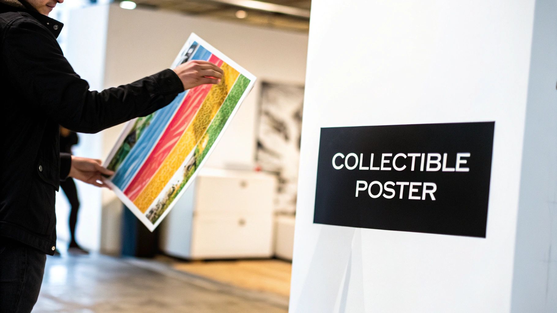 In a world flooded with digital images and fleeting online content, the screen print poster has a kind of staying power. It feels real. It's not just ink on paper; it's a tangible connection between an artist, their fans, and the collectors who cherish their work.
That lasting appeal really boils down to authenticity. Every single poster is the result of a physical, hands-on process. You can feel the craftsmanship in the layers of bold color, the satisfying texture of the ink, and the tiny variations that make each pull unique. It’s a value that a flawless digital ad could never replicate.
A Rich History and Thriving Present
Screen printing has been a cornerstone of visual culture for decades, exploding in popularity during the 1960s counterculture movement and defining the look of an entire generation of music and activism. That history brings a certain weight and coolness to every new print.
Today, that legacy is alive and well in the indie art scene. For bands and independent artists, these prints are far more than just merch—they’re collectible artifacts. The global screen printing market, which is heavily driven by poster production, is projected to hit USD 37,359.1 million by 2030, growing at a steady clip of 10.3% each year. You can dive into the full research on this growing market to see just how big the opportunity is.
This growth points to one simple truth: people still crave tangible art. A limited-edition screen print is a piece of history, a memento from a great show, and a direct line to an artist’s vision.
More Than Art, It's a Smart Business Move
If you're an artist or band selling your work on a platform like OohYeah, a well-designed poster can be a serious revenue stream. It turns your art into a piece of memorabilia that fans are genuinely proud to hang on their walls. Creating a screen print isn't just an artistic choice; it's a strategic one.
- Creates Exclusivity: Limited runs and numbered editions create a sense of scarcity and urgency. This not only drives initial sales but can also increase the poster's value over time.
- Deepens Fan Connection: Offering a physical, high-quality item shows you care about your craft. Fans notice that effort and are more willing to invest in your work.
- Builds a Brand Aesthetic: A consistent style across your gig posters and art prints helps solidify your visual identity, making you more recognizable and memorable.
Ultimately, investing in screen-printed posters is about creating something that lasts. It’s a powerful way to cut through the digital noise and give your audience something real to hold onto.
Designing for the Medium, Not Just the Message
When you're creating a screen-printed poster, you have to think like a printer from the very first sketch. It's a classic mistake to design something that looks amazing on a backlit monitor, only to find it turns into a muddy, disappointing mess on paper. This happens when the design ignores the physical realities of pushing ink through a screen.
This isn't about limiting your creativity. It's about focusing it. Screen printing's magic lies in its bold, graphic nature. It forces you to boil your ideas down to their strongest, most essential forms—a fantastic creative challenge in its own right. Forget about fussy gradients or photorealistic details. This is the world of solid shapes, sharp lines, and intentional color.
Embrace the Power of a Limited Palette
The biggest hurdle for many designers, especially those used to digital work, is trading an infinite color wheel for just two, three, or maybe four colors. Every single color you add means another screen, another pass of ink, and a very real jump in complexity and cost. But trust me, this limitation is your secret weapon.
A tight color palette makes you a smarter designer. You quickly learn to build depth and texture not with shading, but with clever color interactions.
- Overprinting: This is a fantastic trick of the trade. You intentionally print a semi-transparent ink over another color to create a third. A classic example is laying a transparent yellow over a solid blue to get a vibrant green. Suddenly, you have three colors for the price of two screens.
- Juxtaposition: Simply placing two powerful colors side-by-side can create an energy and visual pop that a full-color design often misses. The tension between those colors does all the work.
This is the same mindset you need when thinking about how artists must invest in quality cover art; the visual has to hit hard and communicate a specific feeling instantly. With posters, a few perfectly chosen colors have to carry the entire mood.
Think in Layers and Bold Shapes
Screen printing is a layer-by-layer process, and your design file needs to be built the same way. Every color in your poster will end up on its own layer in your software, which corresponds directly to a physical screen. Getting into this mindset from the beginning helps you visualize how the final print will come together, one pull of the squeegee at a time.
Let's say you're designing a three-color poster: a light blue background, a red illustration, and black text. You'd build this as three separate, solid layers:
- The Blue Layer: The base color block.
- The Red Layer: The artwork that sits right on top of the blue.
- The Black Layer: The text and details that print over everything.
This layered approach is your best defense against common printing errors, like colors that bleed together unintentionally. The screen lays down a solid field of ink; it can't blend like a paintbrush.
This process naturally rewards bold lines and solid, defined shapes. Fine, wispy lines or super-detailed textures are a printer’s nightmare. They have a tendency to get lost or clog the screen mesh, which leaves you with a blurry, incomplete print. Your safest bet is to work with clean vectors and give your lines enough weight to hold a solid body of ink.
Make Typography and Negative Space Work for You
Typography is another area where going bold pays off. Delicate, thin serifs or heavily distressed fonts look cool on screen but often fill in with ink during printing, turning your message into an unreadable smudge. Stick to typefaces with strong, clear letterforms that will stay crisp. When in doubt, make your text a little bigger and bolder than you think you need.
Finally, never, ever underestimate the power of negative space. In a medium that's all about solid blocks of color, the un-inked paper is just as crucial as the ink. Using the paper itself as an element in your design can define shapes, create a focal point, and give the whole piece room to breathe.
A cluttered poster just becomes a chaotic mess of overlapping ink. But a design that strategically uses the paper's color as part of the composition feels intentional, balanced, and far more professional. It’s how you turn a digital idea into a physical object that’s both technically sound and visually stunning.
Mastering Your Pre-Press and File Setup
Once you’ve nailed down a design that truly works for the screen printing medium, it's time to shift gears into the technical phase. This is pre-press, where your digital art gets meticulously prepared to become a physical poster.
Getting this part right is non-negotiable. I’ve seen tiny file setup errors derail entire print runs, costing bands both time and money. Think of this stage as creating the blueprint for your poster—it’s less about creative expression and more about surgical precision. Your mission is to deliver a flawless set of files that will translate your design into perfectly aligned stencils for each color.
This is how you ensure what you see on your screen is what you get on paper. It involves separating your colors, locking in the right resolution, and adding a few technical markers to guide the printing process.
The typical workflow moves from broad concepts to specific, layered files. You start with colors, build out the shapes, and then organize everything into distinct layers ready for separation.
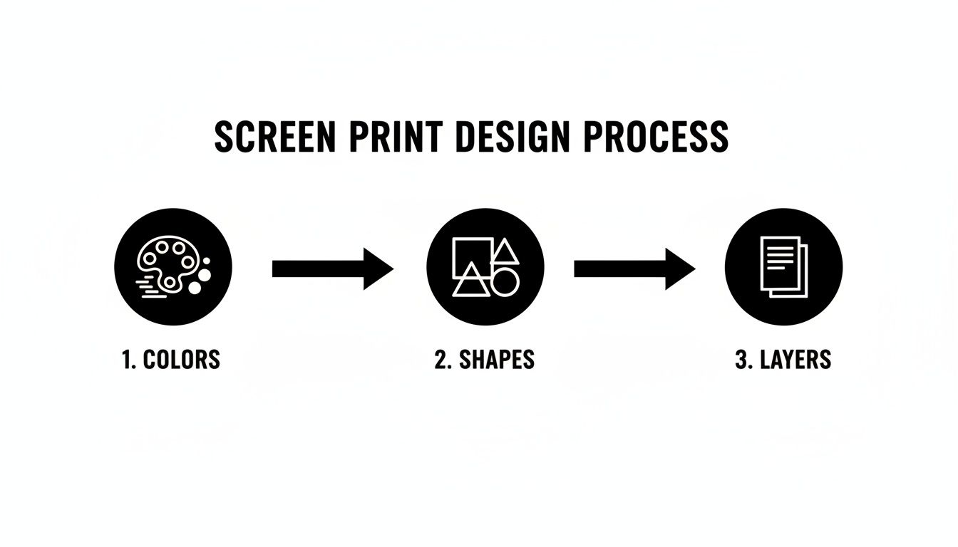
As you can see, each step builds on the last, taking you from a simple color palette to a final, layered file that’s ready to go.
Vector vs. Raster: The Critical Choice
The first big decision you’ll make during file setup is whether to work in vector or raster. Let me make it easy for you: for screen printing, vector is almost always the way to go.
Vector artwork, which you create in programs like Adobe Illustrator, is built from mathematical paths instead of pixels. This is huge, because it means you can scale a vector design to any size imaginable—from a tiny sticker to a massive stage banner—without it ever losing quality. The lines stay perfectly crisp and clean, which is exactly what you need for burning sharp stencils.
Raster artwork, the world of Adobe Photoshop, is pixel-based. It's fantastic for photos and complex textures, but it can be a headache for screen printing if you're not careful. If you absolutely have to use a raster file, you must create it at the exact final print size with a resolution of at least 300 DPI (dots per inch). Any less, and you're asking for blurry, pixelated edges on your final poster.
One of the most common—and costly—mistakes I see is an artist trying to enlarge a low-resolution raster file. The software just stretches the pixels you already have, resulting in a fuzzy, unprofessional print. If you're going the Photoshop route, always start with a high-resolution canvas from the get-go.
For a clearer picture, here’s a quick rundown of how these two programs stack up for screen printing prep.
Choosing Your Tool for Screen Print File Prep
This table breaks down the key features of Illustrator and Photoshop to help you decide which software is the right fit for your poster design workflow.
| Feature | Adobe Illustrator (Vector) | Adobe Photoshop (Raster) |
|---|---|---|
| Best For | Line art, typography, logos, and illustrations with solid colors. | Photographic images, complex textures, and painterly effects. |
| Scalability | Infinitely scalable without any loss of quality. Lines remain crisp. | Resolution-dependent. Cannot be enlarged without losing quality. |
| Color Separation | Simple and precise. Easy to select and separate solid color shapes. | More complex. Requires careful use of channels or selection tools. |
| Edge Quality | Perfectly clean and sharp edges, ideal for creating stencils. | Edges can appear soft or pixelated if resolution is too low. |
| File Size | Generally smaller, as files are based on mathematical data. | Can become very large, especially at high resolutions (300+ DPI). |
While Photoshop has its place, especially for halftones or photo-based designs, Illustrator’s vector-based environment is purpose-built for the kind of clean separations screen printing demands.
The Art of Color Separation
Color separation is the absolute heart of the pre-press process. It’s where you take every single color in your design and isolate it onto its own layer, which you then fill with 100% solid black.
Wait, black? Yep. The film positives used to burn your screens aren’t printed in color. The solid black areas on the film are what block the UV light during the screen exposure process. Where the light is blocked, the light-sensitive emulsion stays soft and washes away, leaving you with an open mesh for the ink to pass through.
Let's walk through an example. Say you have a three-color poster with red, yellow, and blue elements. Your print-ready file won't actually contain those colors. Instead, it will have three distinct layers, each one solid black, representing what will eventually be printed in red, yellow, and blue.
- Red Separation: You’d take all the red elements from your design and convert them to 100% black on their own layer.
- Yellow Separation: Do the same for all the yellow elements, putting them on a separate layer.
- Blue Separation: Finally, all the blue elements get the same treatment on a third layer.
This meticulous process ensures that a unique screen is created for each individual ink color you plan to use.
Adding Registration Marks and Trapping
With your colors separated, there are two final technical touches that make a world of difference: adding registration marks and implementing trapping.
Registration marks are small targets—usually a circle with crosshairs—that you place in the same spot on each color separation layer, just outside the area that will be printed. When it’s time to print, the press operator uses these marks to align each screen perfectly over the last. Trying to get a tight, aligned print without them is a recipe for frustration.
Trapping is a slightly more advanced trick, but it’s vital for preventing those ugly gaps you sometimes see between colors. A printing press is a mechanical beast, and minuscule shifts can happen. If two colors are designed to butt up against each other perfectly, even a tiny shift can leave a sliver of paper showing through.
To fix this, you slightly expand the lighter color so it prints just underneath the edge of the darker color. This small overlap, or "trap," creates a buffer that hides any minor misregistration. For instance, if you have a yellow circle inside a black ring, you’d make the yellow circle just a fraction bigger so the black ink prints right over its edge, guaranteeing a seamless look.
Mastering these pre-press fundamentals is what separates amateur posters from professional-grade prints. It's the behind-the-scenes work that makes your creative vision come to life flawlessly.
Choosing the Right Paper and Inks
You’ve nailed the design file, but that’s only half the story. The next choices you make—the paper and ink—are what turn that digital art into a tangible, collectible piece. These materials aren't just a backdrop; they give the poster its feel, its durability, and a huge part of its perceived value. This is where the real magic happens, so don't skimp.
Think of the paper as the foundation. It’s an active player in your design, not just a surface to print on. The texture, weight, and color will all influence how the final piece looks and feels in someone's hands.
Finding the Perfect Paper Stock
When you start looking at paper, you'll hear a lot about weight and texture.
Paper weight, measured in pounds (lb) or grams per square meter (GSM), is all about thickness and sturdiness. For a legit poster, you want to be in the 80 lb to 100 lb cover stock range. This gives it a substantial feel that resists wrinkles and tears. It immediately tells a fan this is a premium art print, not just a cheap flyer.
Texture, often called "tooth," changes how the ink lays down on the surface.
- Smooth Stocks: Think bristol board. These papers have a super flat, even surface perfect for designs with crisp lines and tiny details. The ink sits right on top, sharp and clean.
- Textured Stocks: Fine art or archival papers often have a subtle tooth that can add a beautiful, organic dimension to the print. The ink sinks in just a little, interacting with the texture to create a hand-pulled, craft feel.
A go-to for many seasoned printmakers is French Paper Company. Their Speckletone and Pop-Tone lines are legendary in the gig poster world for a reason—they offer a fantastic mix of rich colors, consistent quality, and great value.
Here's a pro tip: Let the paper color do some of the work for you. Printing on a cream, off-white, or even a bold colored stock can act as an entire layer in your design. This can save you the cost and hassle of an extra screen and add some serious visual depth.
Selecting Your Inks
Ink is what injects the personality and life into your poster. It affects the color, of course, but also the finish, opacity, and even the physical feel of the print. While you'll see a few types out there, water-based inks are the industry standard for paper. They have a softer feel, are more eco-friendly, and simply air-dry, making them perfect for this kind of work.
Within the world of water-based inks, you’ve got some amazing creative tools at your disposal:
- Standard Opaque: Your workhorse ink. These give you bold, solid colors with great coverage.
- Metallic Inks: Packed with reflective bits that catch the light, these are perfect for adding a high-end shimmer or accent.
- Glow-in-the-Dark: A classic for a reason! These phosphorescent inks soak up light and emit a glow, making them a huge hit for concert posters and limited editions.
- Transparent Extender: This is more of an additive than a color. You mix it into your inks to make them transparent, which is the key to creating those cool overprint effects where overlapping colors blend to make new ones.
Your ink choices should always serve the design's concept. A vintage-inspired folk poster might call for muted, earthy tones, while a poster for an electronic show could scream for fluorescents or metallics.
The demand for this kind of precision printing is why the industrial screen printing market, currently valued at USD 956.0 million, continues to thrive. Flatbed printers, which are ideal for handling various paper stocks, account for 46.7% of this market. This highlights the industry's focus on high-quality, professional gear. If you're curious, you can learn more about these market trends and see how technology is constantly evolving to help artists bring even their wildest ink ideas to life with flawless execution.
Turning Your Posters Into Profit
You've designed, prepped, and printed. Now comes the exciting part: turning all that hard work into a real source of income. This isn't about "selling out"; it's about valuing your art so you can keep making more of it. Let’s get your pricing right and find the best places to sell your work.
The good news? You’re stepping into a booming market. The custom screen printing scene in the US is on track to hit $12.8 billion. That number is driven by fans who are hungry for unique merch that connects them to artists and bands they love. This means there’s a real audience out there, ready to buy what you’re making.
Your job is simply to get your work in front of them and price it in a way that makes sense for both you and your fans.
Calculating Your Costs and Setting Prices
Before you can put a price tag on a single poster, you need to know exactly what it cost you to make. This is where so many artists trip up—they count the paper and ink but forget to factor in their own time, which is your most valuable asset.
Your total cost per poster is a mix of a few key things:
- Hard Costs: This is the straightforward stuff—paper, ink, screen fees, and other tangible supplies.
- Print Fees: If you’re working with a pro shop, this is their charge per print. If you’re pulling the squeegee yourself, think about the cost of screens, emulsion, and wear-and-tear on your equipment.
- Design Time: Don't work for free! Pay yourself a fair hourly wage for every minute you spent designing.
- Overhead: A little buffer for things like software subscriptions, website fees, and marketing costs.
Once you have a solid cost-per-poster number, you can figure out your retail price. A classic formula is Cost x 2.5 = Wholesale Price, and then Wholesale Price x 2 = Retail Price.
But that’s just a baseline. Every artist’s situation is different. I’d recommend exploring different strategies for pricing handmade products to find a model that feels right for your work and your audience.
Sample Budget for a 100-Poster Print Run
Here’s a look at what the numbers might be for a typical three-color, 18x24 inch screen print. This should give you a clearer picture of the investment needed for both DIY and professional routes.
| Expense Item | DIY Printing Cost Estimate | Professional Print Shop Cost Estimate |
|---|---|---|
| Paper Stock (100 sheets) | $75 - $150 | Included in Print Fee |
| Ink (3 colors) | $60 - $100 | Included in Print Fee |
| Screen/Film Setup | $75 (for 3 screens) | $75 - $120 (setup fees) |
| Labor/Print Time | Your Time (e.g., 10 hrs @ $25/hr = $250) | $300 - $600 (print run fee) |
| Total Estimated Cost | $460 - $575 | $375 - $720 |
| Cost Per Poster | $4.60 - $5.75 | $3.75 - $7.20 |
As you can see, the DIY route can save money if you don't count your labor, but a professional shop offers predictability and saves you a massive amount of time.
Limited Edition vs. Open Edition Runs
How you release your posters has a huge impact on their value and how you price them. You've basically got two paths to choose from.
A limited edition means you create a fixed number of prints—say, a run of 50 or 100—and once they’re gone, they’re gone for good. Each print is typically hand-numbered (e.g., 25/100) and signed. This creates scarcity, turning the poster into a collectible and justifying a higher price. It’s the perfect move for a special tour, album release, or a particularly intricate art piece.
An open edition can be reprinted whenever you need more. This is better for your standard band merch or an iconic design you want to keep in stock. The price is usually lower and more accessible, which is great for reaching more fans and focusing on volume.
A hybrid strategy can work wonders. Consider releasing a limited, signed first edition on premium paper for your die-hard collectors. Later, you can follow up with a more affordable open edition on standard stock for casual fans. It’s the best of both worlds.
Finding the Right Sales Channels
Okay, your posters are printed, priced, and ready to go. Now, let’s get them into people's hands. Spreading your bets across a few different channels is the surest way to reach the widest audience.
- Your Own Website: This is your home base. Using a platform like Shopify or Squarespace gives you total control over your brand and lets you keep the biggest cut of the profit.
- Online Marketplaces: Don't sleep on sites like Etsy or OohYeah. They put you in front of a built-in audience of art and music lovers who are already looking for cool, unique stuff. Great for getting discovered.
- At Gigs and Art Fairs: There’s nothing like selling directly to fans. It builds a real connection. This is the prime spot for bundling posters with other merch like vinyl, cassettes, or t-shirts.
- Social Media: Use Instagram or TikTok to show off your work, tell the story behind the design, and drive sales right from your posts or profile link.
For musicians, it's all about integrating merch sales with your music. For a deeper dive, check out our guide on the best ways to sell music online for emerging artists. When you combine smart pricing with the right sales strategy, your screen prints can become a powerful and profitable part of your creative business.
Common Questions About Making Screen Print Posters
As you start turning that digital file on your screen into a physical stack of posters, you’re bound to have questions. This is where the rubber meets the road, and getting solid answers can save you from expensive mistakes and a lot of headaches.
Think of this as your go-to guide for those nagging questions that pop up right before you hit "print."
What’s the Best File Format for a Screen Print Poster Design?
Hands down, vector files (AI, EPS, SVG) are the gold standard for screen printing. They’re built with mathematical paths, not pixels, which means you can scale them to the size of a billboard without losing an ounce of quality. This is the secret to getting those perfectly crisp, clean lines that make a screen print pop.
If you’re stuck working with a raster file from a program like Photoshop, you have to be incredibly precise. Your file must be created at the exact print size with a resolution of at least 300 DPI. If you don't, you'll end up with a blurry, pixelated mess. There’s simply no way to add quality to a low-resolution image after the fact.
A classic rookie mistake is designing something small for social media and then trying to blow it up for a poster. It never works. Always start your design with the final print dimensions and resolution in mind from the get-go.
How Many Colors Should I Use for My First Poster?
My best advice for anyone just starting out? Keep it simple. Stick with one to three colors.
Every color you add brings another layer of complexity, cost, and a new opportunity for things to go wrong. Each color needs its own screen and a separate pass on the press, which means more chances for misalignment (what printers call "registration").
Working with a limited palette isn't just more forgiving; it forces you to be a more creative and intentional designer. Some of the most iconic gig posters in history are brilliant two-color designs, proving you don’t need a full spectrum to create something powerful.
As you get more comfortable, you might want to understand the wider world of poster production. Exploring different types of commercially printed products, like online posters for events or advertising, can give you a broader perspective on how different styles are made and sold.
What’s the Best Way to Ship My Posters Safely?
Don't let your hard work get ruined in transit. A damaged poster means a lost sale and an unhappy fan, so proper packaging is everything.
The best practice is to gently roll the poster with the printed side facing out. This little trick helps prevent the ink from flaking or cracking when it's unrolled.
Once rolled, wrap it in a layer of kraft paper or glassine for extra protection. From there, slide it into a sturdy cardboard mailing tube and make sure the end caps are taped on securely. And one last thing: never, ever fold a screen print. The creases are permanent and will tank the value of the print for any serious collector. For more nitty-gritty details on best practices, our FAQ for creators has you covered.
Ready to turn your incredible screen print poster designs into a real revenue stream? On OohYeah, you can list your art, set your own prices, and sell directly to a community of passionate music and art fans with zero commission fees. Start selling your art on OohYeah today!