Making Your Own CD Covers That Actually Sell
A practical guide to making your own CD covers. Learn design, dimensions, printing, and digital prep to create album art that boosts sales and streams.
February 12, 2026
Music Marketplace Advisor
Buying & SellingCreating your own CD cover is a chance to blend technical know-how with pure creativity. It's about building a visual identity for your music that truly connects with listeners. To get it right, you'll need to understand the specs, pick the right tools, and prep your files for both the physical and digital worlds. This control ensures your album's first impression is exactly what you intend it to be.
Your Cover Is Your Most Powerful Sales Tool
Think of your CD cover as more than just protective packaging. It's the visual handshake that introduces your music to the world. Whether someone spots it on a merch table or scrolls past it on a streaming platform like OohYeah, that artwork is often the one thing that convinces them to hit play. It’s your first and best shot to signal your genre, mood, and artistic identity before a single note is heard.
It’s basically the lead singer for your brand. A strong, well-designed cover immediately suggests quality and sparks curiosity, letting people know the music inside is worth their time and money. That initial connection is what turns a casual listener into a dedicated fan.
The First Impression Is Everything
The power of good visuals isn't just a hunch—the data backs it up. In the ridiculously fast-paced world of streaming, your album art has a mere 0.2 seconds to grab someone's attention.
Industry stats show that professionally designed covers can boost click-through rates by an incredible 47% compared to amateur-looking ones. Even just optimizing your color choices can spike streams by 156%, as certain palettes resonate with specific genre expectations.
Your cover art isn't just an accessory; it's a critical marketing asset. It’s the visual anchor for your entire release campaign, showing up everywhere from social media and press kits to posters and digital storefronts.
Building Your Brand Visually
A standout cover doesn't just earn that first click; it builds your brand over time. When you maintain a consistent visual style across your releases, fans start to recognize your work instantly. This visual language becomes part of your sound, creating a deeper and more cohesive artistic statement.
When you're making your own CD covers, you’re not just designing for a single album. You're laying the cornerstone for your entire visual brand.
Here's why investing time in your cover art pays off:
- Boosts Discoverability: Strong, genre-appropriate visuals help your music stand out in curated playlists and recommendation algorithms.
- Adds Perceived Value: A professional cover signals a professional product, which can lead to more streams and sales.
- Creates a Stronger Fan Connection: Artwork that hits the mark creates a more memorable and meaningful connection to your music.
Taking control of your cover design empowers you to present your music exactly as you hear it. To really grasp its importance, check out our deep dive on why artists should invest in quality cover art.
Getting The Technical Blueprint Right
Before you even think about fonts or color palettes, you need to nail the technical foundation. Getting your CD cover design right from the start saves you from the headache of last-minute redesigns or, even worse, a print run that looks misaligned and unprofessional. Think of it as building the frame of a house—it has to be precise for everything else to fit perfectly.
Every type of CD packaging, whether it's a classic jewel case or a modern digipak, has its own set of exact dimensions. These aren't just suggestions; they're rigid requirements from the manufacturer. Ignoring them is the quickest way to derail a great design.
Jewel Case Dimensions Unpacked
The standard jewel case is probably what comes to mind first, and it’s made of a few distinct parts that need their own design files. You can't just create one square image and call it a day. Each piece has a specific purpose and requires its own carefully measured template.
Here’s a quick rundown of what you'll be working with:
- Front Booklet: This is your main canvas, the first thing everyone sees. It’s a perfect square measuring 4.75 x 4.75 inches. If you're designing a multi-page booklet, every panel follows these dimensions.
- Tray Card: This is the insert that sits behind the clear CD tray. It measures 5.9 x 4.625 inches and includes two thin spines that fold up to form the sides of the case.
- Spines: These tiny but crucial strips on the tray card are just 0.25 inches wide. Your text here has to be incredibly clean and perfectly centered to be readable when stacked on a shelf.
Getting these measurements right is your first step toward a professional-looking jewel case.
A Quick-Reference Dimensions Guide
To make things easier, here’s a table with the essential dimensions for the most common CD packaging formats. Always double-check with your printer for their specific dieline templates, but this guide is a solid starting point for setting up your files.
Essential CD Packaging Dimensions Guide
| Packaging Type | Component | Dimensions (Inches) | Dimensions (Pixels @ 300 DPI) |
|---|---|---|---|
| Standard Jewel Case | Front Booklet/Cover | 4.75" x 4.75" | 1425 x 1425 px |
| Tray Card (Inlay) | 5.9" x 4.625" | 1770 x 1388 px | |
| Spines (part of Tray Card) | 0.25" width | 75 px width | |
| Slimline Jewel Case | Front Insert (J-Card) | 4.75" x 4.75" | 1425 x 1425 px |
| Spine (part of J-Card) | 0.25" width | 75 px width | |
| Digipak (4-Panel) | Each Panel | Approx. 4.9" x 4.9" | Approx. 1470 x 1470 px |
| Cardboard Sleeve | Front/Back Panel | 4.9" x 4.9" | 1470 x 1470 px |
Note: Digipak and custom folder dimensions can vary significantly. Always request a specific template (dieline) from your printing service.
Having these numbers handy ensures your design is print-ready from the moment you create your canvas.
Understanding Bleed, Trim, and Safe Zones
Beyond the basic dimensions, you absolutely have to understand three critical printing concepts: bleed, trim, and the safe zone. Getting these right is the difference between a pro-grade product and one with amateurish white borders or chopped-off text.
The bleed is a small buffer—usually 0.125 inches—that extends your design beyond the final cut edge. Industrial cutting machines aren't perfect, so this extra artwork prevents any unprinted slivers from showing up. The trim line is the actual edge where the piece will be cut to its final size.
Finally, the safe zone is an inner margin, also typically 0.125 inches inside the trim line. All your critical elements—like text, logos, or key parts of an image—must stay inside this zone to guarantee they won't get trimmed off.
Think of it like this: your full artwork extends into the bleed area, the final product is defined by the trim line, and everything you can't afford to lose must stay safely inside the safe zone.
A killer cover design is your first and best marketing tool. It’s what grabs someone’s attention, makes them click, and ultimately convinces them to buy.
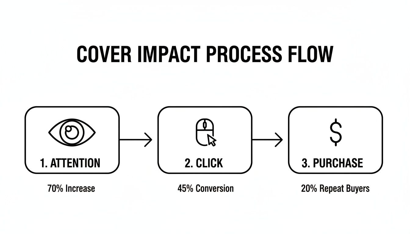
This process shows just how important that initial visual impact is for turning a casual browser into a loyal fan.
Digipaks And Other Formats
While jewel cases are the old standby, formats like cardboard digipaks and vinyl-style sleeves offer a more tactile, premium experience. Their templates are naturally more complex, often involving multiple panels that fold in unique ways. Before you start designing for these, always get the specific dieline from your printer. A dieline is basically a digital blueprint showing all the cut lines, fold lines, and glue areas, making your job infinitely easier.
And don't forget the two golden rules of print design. First, set your resolution to 300 DPI (dots per inch) right from the start for crisp, high-quality results. Second, work in CMYK color mode, not RGB. This ensures the colors on your screen will match what comes off the press. When you need to prep your artwork for digital storefronts, mastering CMYK conversion to RGB is a crucial skill for maintaining color consistency everywhere your music appears.
Design Principles for Standout Album Art
Truly great album art doesn’t happen by accident. It's the result of carefully applying a few core design principles that guide the eye, stir up emotions, and tell the story of your music before a single note is played.
When you're designing your own CD cover, getting these fundamentals right is what elevates your project from a simple placeholder to something iconic. It’s all about making deliberate choices with typography, color, and layout to create a visual that’s every bit as compelling as your sound.
Master Your Typography
The fonts you pick are so much more than a way to spell out your name and album title. They have a personality of their own and can instantly communicate your genre and vibe. A sharp, geometric sans-serif font might feel perfectly at home on an electronic album, while an elegant, flowing script could be the ideal match for a folk or classical record.
Think of your text as another instrument in the mix. The font's weight, the spacing between letters (kerning), and its placement on the cover all play a role. I've seen countless great designs undermined by sloppy or unreadable fonts—it’s one of the fastest ways to look amateur.
Here are a few tips from the trenches:
- Less is More: Stick to just one or two complementary fonts. A strong headline font for your album title paired with a clean, simple font for your artist name is a classic for a reason.
- The Thumbnail Test: Your artist name and title have to be legible, even when shrunk down to a tiny square on Spotify. Take a few steps back from your screen and squint. If you can't make it out, your fans can't either.
- Match the Vibe: Is your music raw and gritty? Maybe a hand-drawn or distressed font is the way to go. Is it cinematic and polished? A classic serif font might be a better fit.
Harness the Power of Color
Color is a direct line to emotion. It’s easily one of the most powerful tools in your design kit for setting a specific mood. The palette you choose will trigger an immediate psychological response, so it’s crucial to pick colors that reflect the emotional heart of your music.
For example, a palette of muted blues and grays can create a feeling of melancholy and introspection, perfect for a somber acoustic album. On the other hand, a burst of vibrant yellows and oranges practically shouts energy and optimism, which would be perfect for an upbeat pop or funk record.
A well-chosen color palette does more than just look good; it acts as a shortcut to the listener's emotions, telling them what kind of sonic journey they are about to embark on.
Start by thinking about the dominant feeling of your album. Is it anger, joy, nostalgia, or peace? Once you have that, you can start exploring color combinations that amplify it. And don't be afraid of simplicity. Sometimes a stark, two-color design has far more impact than a chaotic rainbow of clashing hues.
Create a Strong Composition
Composition is simply how you arrange everything—text, images, shapes—on the cover. A strong composition leads the viewer’s eye exactly where you want it to go, creating a layout that feels balanced and intentional. Principles like the rule of thirds, symmetry, and leading lines are your friends here.
A huge part of composition is visual hierarchy. This just means making the most important thing (like the album title or a key photo) the most prominent. You can do this with size, color, or placement. Decide what you want someone to see first, and make it impossible to miss.
Don't overlook negative space—the empty area around your design elements. It's just as important as the elements themselves. Resist the urge to fill every single pixel. Giving your text and images room to breathe creates a cleaner, more professional look and helps the important parts pop. It directs focus and stops the design from feeling cluttered, which is especially vital for making an impact at thumbnail size.
Choosing Your Tools: From Free Software to AI
With your design principles locked down, it’s time to pick the right digital canvas to bring your vision to life. The great news? You no longer need an expensive software subscription to create a killer CD cover. Artists today have a fantastic range of options, from the industry-standard powerhouses to surprisingly capable free tools and even mind-bending AI generators.
The software you choose really shapes your creative process, so it's worth exploring what fits your skills, budget, and artistic goals. Whether you’re a seasoned pro or a complete beginner, there's a perfect tool out there for you.
Professional-Grade Software: The Industry Standard
For decades, Adobe Photoshop has been the undisputed king of image editing and graphic design. It gives you unparalleled control over every single pixel, with advanced features for color correction, complex layering, and typography that let you execute just about any idea you can dream up. If you need to blend photo elements seamlessly, create intricate textures, or ensure your colors are perfectly calibrated for print, Photoshop is your best bet.
Of course, all that power comes at a price. Photoshop runs on a subscription model, and its steep learning curve can be intimidating if you're new to design. As an artist focused on music, dedicating hours to learning complex software might feel like a distraction. It's the ultimate tool for granular control, but it might be overkill if you just need something quick and intuitive.
Powerful Free Alternatives
Fortunately, the world of free design software is more robust than ever. You don't have to sacrifice quality just because you're on a budget. A couple of standout options offer incredible value for artists making their own CD covers.
- Canva: This browser-based tool is built for speed and simplicity. With thousands of templates, drag-and-drop functionality, and a massive library of fonts and stock images, you can create a professional-looking cover in minutes. It’s an excellent choice if your design is more about great typography and layout than complex photo manipulation.
- GIMP (GNU Image Manipulation Program): Often called the "free Photoshop," GIMP is an open-source powerhouse that offers many of the same advanced features as its paid counterpart. It supports layers, masks, and a full suite of editing tools, making it ideal for artists who want deep control without the subscription fee.
For many independent artists, a tool like Canva is the perfect middle ground. It removes the technical barriers, allowing you to focus purely on the creative side of your album art without getting bogged down in software tutorials.
The New Frontier: AI Image Generators
The most exciting development in DIY album art has to be the rise of AI image generators like Midjourney and DALL-E. These tools can turn a simple text prompt into a unique, high-resolution piece of art in seconds. This completely changes the game for creating complex visuals. Instead of spending hours searching for stock photos or trying to illustrate a concept yourself, you can describe your musical vision and let the AI build it for you.
AI is absolutely exploding onto the DIY CD cover scene. Adoption rates for AI-generated designs are forecasted to hit 35% across the industry. Think about this: before 2020, custom covers could cost independent artists anywhere from $500 to $2,000 per release. Now, AI has slashed that cost to under $50.
One indie band I heard about even redesigned their EP cover with AI-enhanced minimalism and saw a 156% jump in streams just by leveraging some smart color psychology tweaks. You can discover more insights about these emerging album cover art trends on premadepixels.com.
The key to getting great results with AI is crafting the right prompt. You have to be descriptive. Don't just type "sad robot." Try something like: "A lonely, rusted robot sits under a single flickering streetlamp in a rain-slicked cyberpunk city, neon signs reflecting in a puddle, moody, cinematic lighting, photorealistic."
Here’s an example of the kind of detailed, imaginative artwork AI tools can produce from just a text description.
This really showcases how AI can generate not just images, but entire scenes with a specific mood, style, and composition. It's an incredibly powerful ally for any artist making their own CD covers.
From Digital File To Physical Product
This is the moment of truth: turning your digital masterpiece into something real, something a fan can actually hold. It’s a rewarding process, but crossing the finish line successfully means getting a few technical details right. The transition from screen to paper can be tricky, but with a little know-how, you can make sure your physical CD cover looks every bit as good as the design on your monitor.
First, let's talk color. Your screen glows with light using the RGB (Red, Green, Blue) color model. Professional printers, on the other hand, lay down ink using the CMYK (Cyan, Magenta, Yellow, Key/Black) model. If you design in RGB and convert at the last second, you’re in for a nasty surprise—your vibrant colors will likely turn out flat and dull. The solution is simple: set your design software to CMYK before you even start. This ensures the colors you’re working with are an honest preview of the final print.
Ensuring Print-Ready Quality
Next up is resolution, and this is a big one. For sharp, professional-looking print, your files absolutely must be 300 DPI (dots per inch). The 72 DPI standard for web images will look like a blurry, pixelated mess on paper. There's no magic "enhance" button to fix this after the fact, so lock in 300 DPI from the very beginning.
Don't forget the paper itself! The stock you choose has a massive impact on how your project is perceived. Both the weight and the finish play a huge role in the final look and feel.
- Paper Weight: Heavier stock like 100 lb. cover or 14-pt cardstock feels premium and durable. It gives your release a sense of substance, whereas lighter paper can feel flimsy and cheap.
- Paper Finish: A glossy finish makes colors leap off the page, giving your art a modern, high-energy vibe. A matte or uncoated finish offers a more understated, organic feel that works beautifully for acoustic or folk releases.
The tactile experience of your CD cover is part of the art. The weight of the paper and its texture can reinforce the mood of your music, making the physical product a more complete sensory experience for your fans.
Choosing Your Printing Partner
With your files prepped and ready to go, it's time to decide how to get them produced. Each option offers its own blend of cost, quality, and control.
Printing at home might seem tempting for a super small, DIY run, but getting professional color and clean, precise cuts is incredibly difficult without specialized gear. It’s an option, but a risky one.
A local print shop is a fantastic choice if you want a more hands-on approach. You can talk directly with the pros, feel the paper samples yourself, and usually get a physical proof before committing to the full order. This personal touch is great for quality control, though it can be pricier for bigger batches.
For many independent artists, online services like Kunaki, Discmakers, or Mixam are the perfect middle ground. These platforms are built for musicians, offering templates and streamlined ordering that make the whole process a breeze. They’re often the most cost-effective way to produce anywhere from a handful to a few thousand copies.
Once your beautiful CD covers are printed, you'll need to get them where they need to go. Whether you're sending them to a distributor or directly to fans, you’ll want to master shipping labels printing to make sure everything from thermal printers to courier specs is handled correctly.
Before you hit that "submit" button, do one final pre-flight check. Is the resolution 300 DPI? Is the color mode CMYK? Are your text and logos inside the safe zone? Did you include the bleed? A quick five-minute review can save you from a major headache and a costly reprint. And as you get these physical copies ready for the merch table, don't forget you also need to prep your artwork for digital release, which we cover in our guide on how to upload music to streaming platforms.
Optimizing Your Art For OohYeah And Streaming
Your album art's journey is far from over once it's sent to the printer. In fact, its digital life is arguably even more critical. A physical CD cover might be seen by hundreds, but its digital twin on platforms like OohYeah, Spotify, and Apple Music will reach thousands, maybe millions.
Nailing that transition from print to pixel is essential. The real challenge is making sure your detailed, high-resolution design still packs a punch when it's shrunk down to a tiny thumbnail on a phone screen. What looks epic on a 12-inch vinyl sleeve can easily become an unrecognizable smudge online. This is where you need to get smart about digital optimization.
Mastering Digital Specifications
Every streaming service has its own rulebook for album art, but thankfully, they all share some common ground. If you follow a few best practices, your art will look sharp everywhere and get approved without any frustrating upload errors.
First things first: your artwork must be a perfect square. The 1:1 aspect ratio is non-negotiable across the board.
- Resolution: I always recommend starting with a minimum of 3000 x 3000 pixels. This gives you plenty of detail for high-resolution displays and ensures that when platforms inevitably compress or downscale it, the quality remains crisp.
- File Format: Stick with JPG or PNG. JPGs are generally the go-to for photographic images, offering great quality at a smaller file size. If your design is more graphic-heavy with sharp lines or text, a PNG might preserve that clarity a bit better.
- Color Profile: This is a big one. Unlike your print files, your digital art absolutely must be in the RGB color profile. If you upload a CMYK file, you'll end up with bizarre, washed-out colors on screen.
Think of your digital cover as the lead single for your visual brand. It needs to be bold, instantly recognizable, and perfectly formatted to grab attention in a crowded digital space.
Building A Cohesive Digital Presence
Your main album cover is just the starting point. To build a truly memorable brand, you need to think bigger and create a whole suite of visual assets that work together across different platforms. This means adapting your core design for social media banners, profile pictures, and all your promotional posts.
Take your Facebook banner, for example. It's a wide, panoramic shape. Simply stretching your square cover will look awful and unprofessional. Instead, pull elements from your main design—the color palette, the typography, maybe a key background texture—and create a custom banner that feels like it belongs to the same family.
This kind of consistent visual language is what reinforces your artistic identity at every turn. When a fan sees your custom banner on Twitter and then your perfectly formatted cover pops up on their OohYeah feed, it creates a seamless, professional experience that builds trust. To really tie this all together, check out our guide on how to optimize your music metadata for streaming.
Common Questions About Making CD Covers
When you're diving into creating your own CD covers, a few questions almost always pop up. Getting straight answers can save you from a world of frustration (and expensive mistakes), ensuring your final product looks as professional as your music sounds.
Let's walk through some of the most common hurdles I see artists run into.
What are the biggest design mistakes I should avoid?
The most common pitfalls are, thankfully, pretty easy to sidestep once you know what they are. A big one is using low-resolution images. They might look fine on your laptop, but they turn into a pixelated mess in print.
Another classic mistake is choosing unreadable fonts or just cramming way too much information onto the cover. Less is almost always more.
Here's a pro tip: always test your design by shrinking it down to a tiny thumbnail size. If it isn't impactful or legible at that scale, it won't grab attention on streaming platforms where most listeners will see it first.
Forgetting to add a bleed area to your print files is another critical error. Without that small buffer of artwork extending past the trim line, you risk getting unsightly white edges after the cover is cut. It's a small detail that makes a huge difference.
Can I just use images from online? And how do I get the colors right?
It’s incredibly tempting to grab a cool image from an online search, but that's a legal minefield. Nearly every image you find online is protected by copyright. Using one without the proper license can lead to serious legal and financial trouble.
To keep yourself in the clear, stick to these sources:
- Your own original photography or artwork. This is always the best option.
- Images from royalty-free stock sites like Pexels or Unsplash.
- Artwork created by an AI generator—but be sure to double-check its terms of service regarding commercial use.
Now, about color. What you see on your glowing screen (which uses an RGB light-based color model) is often very different from what comes off a printer (which uses a CMYK ink-based model).
To get an accurate match, design your project in a CMYK color profile from the very beginning. If you're planning a major release, I can't stress this enough: always order a single printed proof to check the colors before you commit to a full run. It's a small investment that can save you from a big, expensive disappointment.
Ready to get your music and stunning new cover art out to the world? OohYeah is the all-in-one platform for artists to sell music, merch, and connect with fans—all with zero commission. Start building your career today at https://oohyeah.app.