
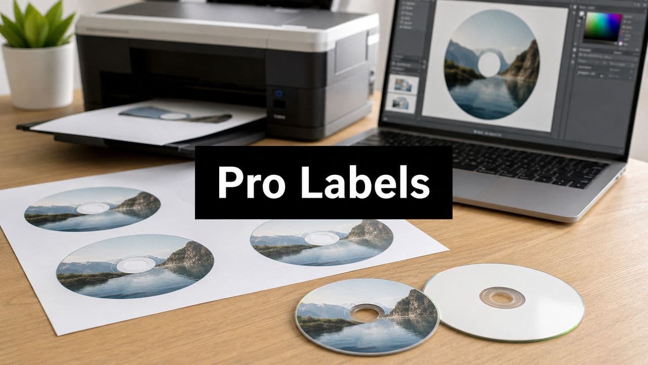
CD Disc Label Template: Create & Print Pro Labels
Learn to create, format, & print a perfect CD disc label template. Get dimensions, software tips, and troubleshooting for a professional finish.
May 25, 2026
Music Marketplace Advisor
Buying & SellingYou've finished the record. The mixes are approved, the master sounds right, and now you're staring at the least glamorous part of the release: getting a physical CD to look like it belongs on a merch table instead of in a desk drawer.
That's where most DIY releases wobble. Not in the music, but in the print. An off-center label, a white ring where color should bleed, type that disappears into the hub, or a disc face that starts peeling after a few weeks can make a solid project feel rushed.
A good CD disc label template fixes a lot of that. It gives you the exact geometry for the stock you're printing on, keeps the center hole where it belongs, and helps you build a file that survives the trip from screen to printer. But there's a bigger decision too. Sometimes an adhesive label is the right move. Sometimes direct-to-disc printing is the smarter call.
Your Music Deserves a Professional Finish
For indie artists, CDs still do a job streaming can't. They're physical proof of the release. They sit on the merch table, go into press kits, and give fans something signed, collectable, and immediate. That only works if the object looks intentional.
The problem is that CD labels are less forgiving than most print pieces. A flyer can survive a slight shift. A square insert can hide a tiny trim error. A disc label can't. If the artwork drifts even a little, the center hole exposes it instantly.
That's why standardized template libraries became normal in the first place. As consumer CD burning took off in the late 1990s, dedicated template systems expanded to solve alignment and stock-matching problems. AudioLabel now lists over 200 CD, DVD, and Blu-ray templates for brands including Memorex and Staples, which shows how specific this workflow became over time in home and small-studio production (AudioLabel template library).
Why templates beat improvising
If you build a disc face from a generic circle in Photoshop, you're guessing at several things at once:
- The outer cut line might not match your actual sheet.
- The hub opening can end up slightly off.
- The sheet layout may not match your printer feed path.
- The margin behavior can change when your print dialog applies scaling.
A vendor-matched template removes those variables before you design a single element.
Practical rule: A CD label isn't just a round graphic. It's a round graphic tied to a very specific sheet, adhesive stock, printer path, and center opening.
What professional-looking actually means
On a finished disc, “professional” usually comes down to a few visible details:
- Centered artwork: The ring around the hub looks even.
- Controlled typography: Small text stays out of the inner distortion zone.
- Consistent color: The face matches the insert and tray card.
- Clean production choices: The label method fits the release type.
That last point matters more than people think. A quick promo run and a deluxe album package don't need the same production method, even if they use the same album art.
Nailing the CD Label Dimensions
Bad dimensions ruin print runs faster than bad design. You can recover from an average layout. You usually can't recover from a template mismatch once the sheet is printed and the circles don't line up with the cuts.
For CD labels, the safest starting point is the vendor's own geometry. A common stock example is the OL5625, which specifies an outer width of 4.6875 inches, a height of 4.656 inches, 2 labels per 8.5 x 11-inch sheet, zero horizontal spacing, and 0.375-inch vertical spacing (OL5625 template specs). Those values matter because your software file isn't only defining the disc face. It's defining where that face sits on the printable sheet.

The dimensions that matter most
Here's the part many artists miss. There isn't one circle. There are several working zones inside the template, and each one affects whether your final label looks clean.
| Element | Diameter (Inches) | Diameter (Millimeters) |
|---|---|---|
| Outer edge | 4.6875 | 119.06 |
| Inner hole | 0.59 | 15 |
| Printable area | Varies by stock and template | Varies by stock and template |
| Safety margin | Not a fixed diameter | Not a fixed diameter |
The outer figure above comes from the vendor template spec. The inner hole figure reflects the standard central opening referenced in the infographic context. The printable area and safety margin depend on the template design and how conservatively you want to place important artwork.
Why generic circles fail
Designers who don't work in physical media every week often make the same assumption: if the disc is round, a circular canvas is enough. It isn't.
A real sheet template also accounts for:
- Sheet placement: where each label sits on the page
- Gap and pitch: how far apart labels are vertically
- Printer margin behavior: how your desktop printer shifts printable content
- Cut tolerance: how much room you need so small drift doesn't clip the design
If you're also printing inserts or tray cards, it helps to choose the right heavy cardstock for the paper components so the whole package feels coherent rather than pieced together from mixed materials.
The fastest way to waste label stock is to design the disc correctly and the page incorrectly.
A safer setup
Before opening Illustrator, Photoshop, Word, or anything else, check three things against the stock packaging or template download:
- Page size must match your print sheet.
- Template version must match the exact label product.
- Print scale must stay at actual size, not fit-to-page.
For CD labels, precision isn't cosmetic. If the hub opening sits even slightly off-center, the finished label looks wrong immediately, and application becomes harder than it should be.
Designing Your Label in Popular Tools
The best disc-face designs respect the shape instead of fighting it. You're not laying out a square poster and cropping it into a circle later. You're designing around a hub, an outer edge, and a set of danger zones where text and small details can distort or disappear.
Professional template systems separate live area, trim edge, and bleed, and they support common production tools including Adobe Illustrator, InDesign, Photoshop, and Word. That matters because those zones help preserve clean output and keep critical text away from the center hub, where DIY designs often fail (disc template guidance).

Adobe Illustrator and Photoshop
Illustrator is usually the cleanest tool for a CD disc label template because vector paths stay sharp and circular geometry is easier to control. Build your artwork on the vendor template layer, lock the guides, and keep separate layers for background art, text, and technical marks.
Photoshop works well too, especially for photographic artwork, but it's easier to drift into sloppy setup. The most common mistakes are flattening too early, eyeballing the hub area, and placing text too close to the inner ring because it looks balanced on screen.
A solid workflow in either app looks like this:
- Use the supplied template layer: Don't redraw the outer edge and hub manually.
- Keep text on paths where needed: Curved type around the top arc or lower arc reads cleaner than fake warping.
- Respect the live area: Album title, artist name, and legal text should stay clear of the hub.
- Export at print quality: Don't hand the printer a low-resolution screenshot of your own design.
Word and simple template editors
Word is more limited, but some vendors provide Word files because plenty of people need a workable solution rather than a designer's ideal setup. If you use Word, keep the design simple. Full-bleed photo backgrounds and ultra-fine text are where Word tends to show its limits.
The main quirks are familiar:
- Text boxes can shift slightly when fonts substitute.
- Images may compress unless settings are handled carefully.
- Shapes that look centered visually may not stay centered in print.
For basic logos, titles, and a restrained color field, it can still get the job done.
Free tools and practical compromises
GIMP, Canva, and browser-based editors can work for a promo run if you're disciplined. The trick is not treating them like toy versions of pro software. Import the template as a guide, build your artwork within the safe region, and check the hub opening before export.
If you want more design workflow ideas for musician-focused visuals, the broader creative discussions on the OohYeah blog are useful for thinking beyond just the disc face.
Don't judge a CD label by the mockup. Judge it by the printed ring around the center hole and by whether the smallest text stays readable after application.
Design choices that hold up in print
A few approaches survive printing better than others:
- High-contrast titles: Thin gray type over a dark photo tends to break down.
- Bold central imagery with quiet edges: The disc shape crops busier compositions harshly.
- Short text near the top or bottom arc: Curved type works best when it isn't overloaded.
- Minimal hub-area detail: That region attracts visual distortion and application errors.
I'd rather see a restrained one-color disc face with clean type than a cluttered layout trying to use every millimeter of the circle.
Printing Your CD Labels with Precision
A disc label file can be perfectly built and still fail at the printer. Most problems happen after design is finished. Wrong media settings, automatic scaling, feed slippage, or skipping the test sheet can wipe out an entire pack of labels.
The reliable workflow is straightforward. Start from the template, customize the design, and run a test print on regular paper before printing on label stock, which is the process recommended in RonyaSoft's disc-label tutorial (RonyaSoft CD label workflow).
A visual checklist helps at this stage.

The print settings that matter
When sending a disc-label sheet to a desktop printer, ignore flashy features and focus on control.
- Paper type: Match the printer setting to the label stock as closely as possible.
- Print quality: Use the higher-quality mode if the stock supports it.
- Scaling: Keep output at actual size.
- Single-sheet feeding: Feed one sheet at a time if your printer tends to skew specialty media.
A lot of home printers try to help by resizing, centering, or adjusting margins automatically. That “help” is what usually causes drift.
The test sheet method
Print the template on plain paper first. Then place that paper over a real label sheet and hold both to the light. You're checking whether the outer ring, the hub opening, and the page position all line up.
That test catches most expensive mistakes before they become permanent.
“Always run the plain-paper test first. It's faster than rebuilding a design after discovering the printer shifted the whole page.”
Here's a useful demo of the physical side of the process:
Applying the label without ruining it
Printing isn't the finish line. Application can still wreck a clean job.
Use an applicator if you have one. If you don't, work slowly and align the center opening first. Once the adhesive touches the disc off-center, trying to peel and reposition it often stretches the label or introduces bubbles.
A few habits help:
- Handle by the edges: Finger oils show through on some finishes.
- Press from center outward: That reduces trapped air.
- Check the hub ring immediately: You'll spot centering problems fast.
- Let the print cure before handling heavily: Freshly printed surfaces mark easily.
For short-run merch, this method is workable. For a polished retail-style finish, it's still the more fragile option.
Troubleshooting Common Alignment Problems
Most CD label errors look dramatic but come from a small cause. Don't assume the design is wrong just because the print is off. In many cases, the file is fine and the output settings are the problem.
The print is off-center
If the whole label is drifting left, right, up, or down, look at the print dialog first. Printer drivers often add margin compensation or alter positioning based on the selected paper type.
Try this sequence:
- Disable scaling: Anything like fit-to-page, shrink to printable area, or borderless correction can shift the file.
- Confirm the sheet orientation: Portrait and other orientation mismatches can offset label placement.
- Print another plain-paper test: Change one variable at a time so you know what fixed it.
If the drift is slight, some programs let you nudge placement in the print settings. Make tiny adjustments and retest rather than rebuilding the layout.
The artwork prints too large or too small
This almost always comes from software interpreting the template as an image instead of a print document. PDF viewers can also sneak in scaling without making it obvious.
Use these checks:
- Actual size only: Never let the app “optimize” the page.
- Correct template file: Similar-looking products can have different sheet geometry.
- No export mismatch: A flattened file exported with the wrong page box can break placement.
The color looks weak or streaky
That issue usually isn't the template. It's the printer.
Run a maintenance cycle, check nozzles if your printer supports it, and make sure the media setting matches the stock. Glossy label surfaces printed under a plain-paper setting often look washed out or uneven.
If the circle is wrong, suspect scaling. If the color is wrong, suspect printer settings. If the hole is wrong, suspect the template.
The label applies badly even after printing correctly
That points to handling, not layout. The adhesive may be grabbing before the label is centered, or the stock may be curling slightly after printing.
If you keep seeing application problems, check the help material in the OohYeah support center for broader creator workflow guidance, then consider whether your release has outgrown adhesive labels altogether. At some point, the fix isn't a better print tweak. It's a different production method.
Beyond Adhesive A Strategic Choice for Your Art
A lot of CD label advice stops at “here's how to print one.” That's not enough. The better question is whether you should be using an adhesive label at all.
For a rough promo batch, adhesive labels still make sense. They're accessible, familiar, and good enough when speed matters more than permanence. For a finished release you want fans to keep, gift, archive, or review professionally, they start to show their limits.

Where adhesive labels still work
Adhesive labels are a practical choice when:
- You need a small promo run: Demos, tour samplers, or hand-to-hand outreach copies.
- You're using equipment you already own: A desktop printer and label sheets are enough.
- The packaging is intentionally DIY: Some releases benefit from that handmade look.
Used carefully, they can look decent. But they don't become archival just because the artwork looks polished.
Where direct-to-disc printing wins
Preservation guidance associated with the Library of Congress advises against pressure-sensitive adhesive labels for archival discs because of risks including peeling and chemical damage, a point highlighted in Worldlabel's CD template guidance (Worldlabel CD template page). That changes the conversation for artists making serious release copies.
Direct-to-disc printing is usually the stronger option for:
- Deluxe album editions
- Permanent catalog stock
- Review copies where presentation matters
- Masters or archive-oriented copies
The finish looks cleaner because the art sits on a printable disc surface rather than on a separate adhesive layer. You also avoid the extra balancing and peeling concerns that come with stick-on labels.
Choosing based on the release, not just the budget
This decision is really about fit.
A hand-sold promo CD after a local set can get away with an adhesive label if it's applied cleanly and designed with restraint. A premium release with custom inserts, shrink-wrap, and a polished brand identity looks mismatched if the disc face feels like the weakest production element.
If you're building a serious artist storefront and thinking beyond one release, the presentation side matters just as much as the audio side. There's useful context around selling music and merch directly in the guide on selling your music.
A disc face isn't just decoration. It tells the buyer whether this is a quick handout, a collectible item, or a release you expect to represent your catalog for years.
If I had to reduce it to one practical rule, it's this: use adhesive labels for speed and flexibility, use direct-to-disc printing for durability and credibility.
If you're ready to turn finished music into something fans can buy, collect, and support directly, OohYeah gives artists one place to stream, sell, market, and manage their work without handing control to a middleman.