
CD Cases Printing Guide for Indie Artists That Sells
Master CD cases printing from artwork and bleed to case choice and quality checks. Save money and sell physical CDs with OohYeah.

September 19, 2026
Music Marketplace Advisor
Buying & SellingYou've got the masters done, the cover looks sharp on your screen, and you're ready to order CDs for a release show or a direct-to-fan bundle. Then the printer sends back a proof with clipped spine text, a back card that doesn't sit straight in the tray, or artwork that looked rich in RGB but turned muddy in print. That's where most indie CD projects go sideways.
The problem usually isn't the music. It's the fit between the artwork file and the packaging format. A jewel case, a digipak, a slimline case, and a sleeve don't fail in the same way. Hidden plastic borders cover art differently than folded board panels. Spine width changes what text is readable. A file that works for one supplier can break at another because “standard” often means finished size in one template and flat production size in another.
I've seen the same pattern over and over in small-run merch. Artists spend money on discs and rush the printed parts. Then they eat the cost of reprints, delay launch day, or ship something that feels cheaper in hand than it should. Good CD cases printing is less about fancy packaging and more about controlling where the design bends, trims, hides, and lands.
Why CD Cases Printing Still Matters for Indie Releases
A CD still does a job streaming can't do by itself. It gives the fan something physical to carry home, get signed, photograph, gift, and add to a bundle. At a merch table, that matters. Online, it matters differently. A CD with thoughtful packaging feels like a complete product, not just a file on a platform.
The compact disc launched in 1982, and the jewel case became the dominant format with a standardized outer size of 142 mm × 125 mm × 10 mm, plus a 120 mm × 120 mm front insert and a back card around 150 mm × 118 mm. That standardization made packaging easy to reproduce across plants and retailers, and it's still the reason CD artwork templates feel so fixed today (optical disc packaging overview).
Physical merch still wins on feel
When fans buy a CD at a show, they aren't comparing it to a streaming subscription. They're reacting to what's in their hands. If the insert is buckled under the tabs, if the tray card is off-center, or if the spine text disappears into a score line, the package feels homemade in the wrong way.
Good printing fixes that. The package opens cleanly. Credits are readable. The spine is legible in a crate or on a shelf. The front art sits square under the plastic without getting cropped by the locking teeth.
A CD package doesn't have to look expensive. It has to look intentional.
That's why CD cases printing still matters for indie artists who sell direct. Fans read quality fast. They can tell when you used the right template and when you guessed.
Small-run success depends on fewer mistakes
The jewel case has been in continuous use since the first CD releases, and Philips-linked historical summaries note that many billions of jewel cases have been produced, with output at one point reaching 8 billion cases per year (CD jewel case history and scale). That scale is exactly why the format still works for indie merch. The supply chain understands it.
What trips people up isn't availability. It's file prep. A standard package can still fail if the art doesn't match the exact insert style your printer uses.
If you're building a release around direct fan support, it helps to think beyond just getting discs manufactured. Your storefront, bundles, and merch presentation matter too, especially if you're using an artist platform like OohYeah for artists. The CD needs to arrive looking like a finished release, not a compromise.
Choosing the Right Case Style and Materials for Your Music
Most indie artists ask the wrong first question. They ask, “What size is a CD cover?” The better question is, “Which package gives me the fewest production problems for how I sell?”
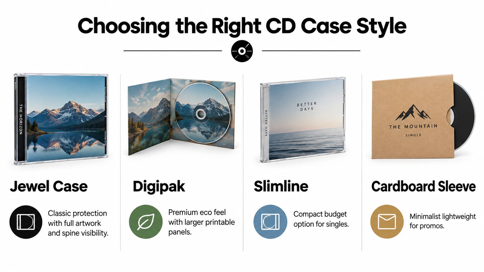
That answer changes depending on whether you're selling at shows, mailing small orders, or building bundles with shirts and stickers. A jewel case can look classic and protect the disc well, but it adds more printed parts and more places for alignment errors. A sleeve is simpler, lighter, and often kinder to your budget. A digipak sits in the middle if presentation matters more than speed.
What each format really changes
Here's the part artists usually feel only after ordering.
| CD Case Formats Compared for Indie Artists |
|---|
| Case Format | Best For | Print Complexity | Cost and Shipping Impact |
|---|---|---|---|
| Jewel case | Full album releases, retail-style presentation, visible spine title | Higher because you're managing front insert, tray card, possible booklet, and disc face | Heavier and bulkier to ship, more parts to replace if one print element fails |
| Digipak | Premium presentation, art-driven releases, giftable bundles | Moderate to high because folds and panel mapping must line up | Lighter than jewel case, usually better for mailed merch than brittle plastic |
| Slimline | Singles, promos, lean tour stock | Moderate because reduced spine area leaves less room for error | Compact and easier to carry, but less room for inserts and booklet content |
| Cardboard sleeve | Budget runs, direct-to-fan orders, simple merch bundles | Lower because there are fewer components and no tray card | Lightest to ship, easiest to store, often the safest option for small runs |
The format that looks best isn't always the format that sells best
A jewel case gives you a familiar retail object. It also gives you more ways to mess up a job. You have a front insert under tabs, a back card wrapping around the tray, a narrow spine, and often a booklet. If one component shifts, the whole package looks off.
Digipaks remove the brittle plastic box but introduce fold planning. That's fine when your art is built for panels. It's a problem when someone tries to stretch a square cover concept across multiple faces without considering where the board bends.
Sleeves are less glamorous on paper, but for a lot of independent releases they're the smartest choice. Fewer parts. Less shipping bulk. Less chance of spine text getting trapped in a fold because there often isn't a true spine to manage at all.
Practical rule: If you're on a tight budget and selling mostly through mailers or bundled merch, simpler packaging usually beats “premium” packaging.
Match the case to the sales channel
I'd choose differently for each of these situations:
- Tour table stock: A jewel case or digipak works if fans are browsing physically and you want visible spines in display racks.
- Mail-order bundles: Sleeves and compact board formats travel better and take less packing material.
- Promo singles or samplers: Slimline cases can work, but only if you're comfortable with very limited spine real estate.
- Collector-focused release: Digipaks can carry the most visual personality if the artwork is designed panel by panel.
Material references can help when you're thinking about storage and presentation beyond standard music packaging. For artists comparing protective formats or archival-style holders, browsing CD DVD cases from Grainmark Leather can be useful just to see how different case constructions change handling and display.
Designing Artwork That Prints Perfectly Every Time
Most print failures happen before the file is uploaded. The artwork may be strong, but the layout logic is wrong. That shows up on the spine first, then at the trim edge, then under the plastic where hidden borders cover details the artist expected to be visible.
The safest way to approach CD cases printing is to treat every panel as a production surface, not just a design surface. Front insert, tray card, spine, and disc face each have different limits.
Front insert and back card aren't the same job
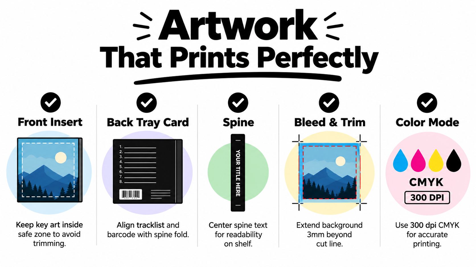
The front insert for a standard jewel case sits in a 120 mm × 120 mm square, while the back printed piece is a larger card that wraps and folds behind the tray in a different shape (jewel case print piece dimensions). Artists often design one beautiful square and assume the rest will sort itself out. It won't.
The front insert is where strong image hierarchy matters most. Artist name, release title, and focal image need to survive the visual interference of tabs and reflections from the plastic lid. The back card has a different purpose. It needs to carry track listing, credits, legal copy if you use it, and any spine information without feeling cramped.
A few layout habits consistently work better than others:
- Keep key art inward: Faces, type, logos, and high-contrast edges shouldn't sit near trim or under tabs.
- Build the back around folds: Track names should align visually with the center panel, not drift toward the spines.
- Treat the spine as functional first: Readability beats decoration every time.
Spine mistakes ruin otherwise good packaging
The spine is where indie files give themselves away. Text that looks centered on screen can wrap into the fold, disappear under the score, or read unevenly once the tray card is inserted. Long titles are the first casualty.
Professional guidance for jewel-case tray cards typically uses a 151 × 118 mm flat layout with 3 mm bleed, and a practical rule is to keep spine typography at least 1.5 mm away from score lines. The same guidance treats 300 dpi CMYK as the safest working spec for press output (CD covers printing specs and template guidance).
If your spine text only works when everything trims perfectly, it doesn't work.
That one decision saves a lot of reprints. Center the spine text optically, keep it clear of folds, and don't force too much copy into a narrow area.
What sharp on screen means in print
Designers who live in digital tools often trust the screen too much. A bright RGB blue, tiny condensed credits, or grainy export might feel acceptable at full monitor size. In hand, none of that forgives itself.
Use production-friendly habits from the start:
- Work in CMYK: Don't leave conversion until export.
- Set image assets to 300 dpi at placed size: Upscaling at the end won't restore detail.
- Choose readable small type: Tiny credits are fine only if they remain clean after print and fold.
- Check black text carefully: Small type needs crisp separation, not a muddy composite look.
For artists building a broader merch world, I often recommend looking at adjacent print categories too. A good reference point is how a premium vinyl decal shop presents cut lines, material choices, and production previews, because sticker workflows teach the same discipline around edge control and print-safe design.
Preparing Print Ready Files With Templates Bleed and Color
A lot of indie CD packaging goes wrong before anyone hits print. The artwork looks fine on screen, the export passes, then the finished piece arrives with spine text riding a fold, a tray card shifted under plastic, or a digipak panel showing a hairline of white at the edge. In small runs, that kind of miss hurts because the unit cost is already high and a reprint can wipe out your margin.
Start with the exact packaging template
Template fit is where jewel cases, digipaks, and sleeves stop being interchangeable.
A jewel case back card can forgive a little visually because the plastic and tray hide part of the piece. A digipak cannot. Its score lines, glue areas, and folded returns all eat into artwork in ways newer artists miss. Sleeves look simpler, but they often create the same problem at the opening edge and spine area because the visible face is smaller than the flat template suggests.
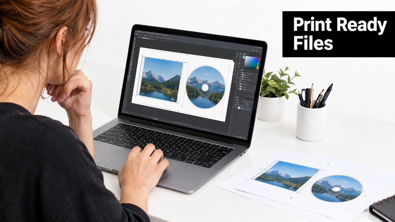
I lock the format before any design work starts. Then I get the current printer template for that exact SKU, not a close version from an old job. Even two vendors selling a “4-panel digipak” can build the spine differently, and that difference changes panel width, fold position, and where artwork disappears after assembly.
For standard jewel-case back cards, the working file is usually larger than the visible piece because it includes bleed and wrap. If you build only to what shows once inserted, the printed card can still be technically correct and look off in the case.
Hidden borders cause more failures than bad artwork
Indie designers usually watch the trim line and forget the covered areas. That is the expensive mistake.
Plastic lips on jewel cases hide edges. Digipak score lines can crack dark ink if artwork sits awkwardly across the fold. Sleeves often need extra care at the mouth because backgrounds that look centered on the flat can look short once the package is glued and stacked. Spine width is the main trouble spot across all three formats. If the spine is narrow, aggressive typography rarely survives real production movement.
My preflight check is simple:
- Match the flat template exactly: Build to the vendor's file, not a guessed finished size.
- Carry backgrounds through bleed: Edge art needs enough extension to survive normal trim shift.
- Keep text out of hidden structure: Tray wraps, glue flaps, folds, and plastic borders steal more space than the mockup shows.
- Check spine copy after panel widths are final: A spine that works on a jewel case may fail on a digipak or printed sleeve.
- Outline or package fonts if required: Reflowed type can push credits or catalog numbers into unsafe areas.
- Export the file type the printer asked for: Usually a press-ready PDF, flattened if their workflow is fussy.
The same discipline shows up in other small-format print work. The nursery name labels sticker guide gets this right. Templates, bleed, and readable sizing are decided before export, not after the proof comes back.
Color setup is where screen habits cost money
RGB files, rich black body text, and low-res placed art still show up in indie orders every week. They are fixable early and annoying later.
Set the document up in CMYK from the start if your printer specifies CMYK workflow. Keep small black text on a clean black plate when possible instead of building it from multiple inks. Check placed images at final size, not enlarged on screen, and look hard at dark gradients that cross folds because they are often where banding, cracking, or scuffing becomes obvious in hand.
Disc art needs its own file check too. The printable ring is tighter than many first-time buyers expect, so artwork that looks balanced in a mockup can lose detail near the hub or outer edge. I treat the disc face as separate production art, not an extension of the front cover.
Format choice affects file risk and direct-to-fan costs
For direct-to-fan sales through OohYeah, sleeves are often the easiest format to get right and the cheapest to ship, especially for small merch drops where postage matters. Jewel cases protect better in retail-style handling, but they crack in transit and add weight. Digipaks usually look better on the table and feel more premium, yet they demand the most care in setup because fold tolerance, spine width, and panel alignment have less room for error.
That is the production-fit gap artists miss. The format that looks best in a mockup is not always the format that prints cleanly, packs fast, and lands safely with fans.
Proof the export before you upload it
Open the final PDF at actual size and review it like a production file, not a design file. Check every spine, every fold crossing, every barcode, and every element sitting near a hidden border. I also print a paper dummy and fold it. Ten minutes with scissors catches problems that a polished on-screen mockup hides.
If you need platform-side order and support details, OohYeah's FAQ for CD and merch selling is the right reference. File accuracy still comes down to your setup before the order is placed.
Ordering Proofing and Selling Your CDs With OohYeah
You finish the artwork at midnight, upload the files, approve the proof too fast, and two weeks later the CDs arrive with a spine that drifts off center or a back panel that disappears under the tray. I have seen that happen on all three formats. The painful part is that the files often looked fine on screen.
Ordering goes better when proofing is treated as part of production cost, not as dead time. A digital proof catches missing text, bad exports, and obvious alignment errors. A physical proof answers different questions. Does the jewel case tray hide more of the card than the template suggested? Does the digipak fold land on a face? Does the sleeve opening scrape ink or show white at the edge after filling?

What to inspect before you approve
Check the proof in the order a fan handles it, not in the order the PDF pages appear.
For jewel cases, inspect the visible front area through the plastic, then the spine, then the tray card after it is inserted. Hidden borders steal more room than first-time buyers expect. For digipaks, check every fold, especially where artwork crosses panels. A small shift there looks much worse than the same shift on a sleeve. For sleeves, check opening-side tolerance and edge wear. They are simpler, but a background pushed too close to the cut can still flash white once the piece is glued and packed.
My approval list stays short:
- Visible front area: No important detail under tabs, tray overlap, or trim risk.
- Spine setup: Readable at a glance, centered well enough to survive normal production movement.
- Back panel fit: Track list and credits sit correctly in the area fans will see after assembly.
- Finish behavior: Dark fills, fine type, and solids still look clean after handling.
- Format fit: The package still makes sense for how you plan to sell and ship it.
Set your reject rules before delivery
Do this before the cartons land.
You do not need a formal factory inspection plan, but you do need clear pass-fail standards. Otherwise every flaw turns into an argument after delivery, when time matters most.
For small-run CD jobs, I sort problems into three buckets:
- Reject and report immediately: wrong print file, unreadable spine, damaged discs, missing inserts, incorrect packaging style
- Review for replacement or partial credit: miscuts, obvious registration drift, cracked jewel cases, tray cards that buckle or do not seat properly
- Acceptable with sorting or discounting: light cosmetic variation that does not affect use or shelf appeal
That approach keeps the conversation practical. You are not arguing about taste. You are checking whether the run matches the approved proof and whether it is sellable at full price.
Selling direct works better when the package fits fulfillment
The cheapest package to print is not always the cheapest package to sell. Jewel cases can still work for catalog titles or fans who want the classic retail look, but they add weight, crack in transit, and usually need more packing material. Digipaks present well at the merch table, yet they cost more to get right because panel alignment and spine width leave less room for error. Sleeves are often the strongest direct-to-fan option for small runs because they print, pack fast, and keep postage under control.
That matters if you are mailing one CD at a time.
If you want to sell the release alongside the rest of your merch, the OohYeah music and merch marketplace gives you a clean place to list CDs, bundles, and variants without separating the physical product from the rest of your catalog. Clear photos help here. So does naming the format in the listing. Say jewel case, digipak, or sleeve outright, and mention extras like booklets, signed inserts, or bundled shirts so fans know what they are paying for.
The package that survives production cleanly usually sells more smoothly too. That is why format choice, proofing discipline, and fulfillment cost belong in the same decision.
Final Checklist for Flawless CD Cases Printing Results
Most failed CD packages come from three decisions made too casually. The artist picked the wrong format for the sales channel. The file was built to a guess instead of the exact template. The proof was approved too quickly.
Get those three right and the rest becomes manageable. That's true whether you're pressing a full album in a jewel case or keeping it lean with a sleeve for bundles and mail orders.
The short version that saves money
Use this before you click approve:
- Choose the package for how you sell: If shipping efficiency and low risk matter most, simpler formats usually outperform bulky ones.
- Design to the template: Don't build around a generic square and hope the printer adapts it.
- Protect the spine and folds: Readability and safe placement beat squeezing in extra text.
- Check assembled behavior: Packaging has to work in hand, not just as a flat PDF.
- Decide your defect tolerance early: Know what you'll reject before production lands.
A lot of indie artists still default to jewel cases because they feel “official.” Sometimes that's right. Sometimes it's the expensive choice that creates extra print parts, extra handling risk, and extra shipping bulk without adding much value for the buyer. Sleeves and compact board options often look cleaner in a direct-to-fan setup because they reduce the number of failure points.
The best CD package isn't the one with the most components. It's the one that arrives looking deliberate, survives the mail, and feels worth buying.
If you're turning a physical release into ongoing merch income, OohYeah gives you a music-first place to sell CDs alongside downloads, streaming, bundles, and fan extras without splitting your audience across scattered tools. It's a strong fit for indie artists who want the packaging work to pay off through direct sales, cleaner merch presentation, and better control over how a release reaches fans.