
A Musician's Guide to Professional CD Case Printing
Master CD case printing from start to finish. Our guide covers packaging options, design specs, and print preparation for independent musicians.
January 25, 2026
Music Marketplace Advisor
Buying & SellingPrinting your CD case is how you turn your music into a tangible piece of art. It’s often the very first physical connection a fan makes with your new album, so it has to look right. This means picking the best packaging—like a jewel case, digipak, or a simple sleeve—and then getting your artwork prepped with the right technical specs for a professional print run. Nail this, and you'll have retail-ready CDs that look every bit as good as they sound.
Laying the Groundwork for Your Album Release
Making a physical CD is so much more than just burning some audio files onto a disc. It's about creating an experience—a physical extension of your artistic identity. For indie artists, diving into professional CD printing can feel a bit overwhelming, almost like learning a new language filled with technical jargon. This guide is your roadmap to cut through that noise and make sure your vision comes to life exactly as you imagined it.
It all starts with your packaging choice. Think of the case as the first handshake with your listener; it sets the entire mood before they even press play. Are you going for the classic, sturdy feel of a jewel case? Or maybe the modern, eco-conscious vibe of a digipak? You could also keep it simple and cost-effective with a minimalist cardboard sleeve. Each option tells a different story.
“It was important that the zine harken back to this handmade ethos, and allow fans to have a physical artifact of an otherwise dispersed, ephemeral music scene.” - Jesse Pimenta, on creating physical media for Dance Data record label.
The path you choose here will define your creative canvas and, just as importantly, your project's budget.
Understanding Templates and Dielines
After you've landed on a format, the next piece of the puzzle is the print template, which you'll hear referred to as a dieline. A dieline is basically the blueprint for your CD case. Your printer will give you a digital file that maps out all the crucial lines: where the paper will be cut, where it will be folded, and the safety margins you need to respect. Trust me, ignoring this blueprint is one of the easiest—and most expensive—mistakes you can make.
Sticking to the dieline is non-negotiable. Here’s why:
- It keeps your art safe. Any critical text, like your album title or the tracklist, needs to stay inside the "safe area" so it doesn't get chopped off during trimming.
- It ensures perfect folds. If you're making a digipak or an insert booklet, the dieline makes sure every panel folds precisely where it's supposed to, so your artwork lines up beautifully.
- It makes the spine readable. The template gives you the exact dimensions for the spine text, ensuring it’s centered and looks great on a shelf.
Treating the dieline as your guide is the secret to a smooth print run. It helps you avoid frustrating delays, the horror of paying for reprints, and the disappointment of getting a final product that just doesn't look right. Getting these early steps down empowers you to produce a polished, professional-grade album you can be proud of. And as you get closer to launch day, make sure your physical release strategy lines up with your digital one. For more on that, check out our guide on the best practices for releasing new music online.
Choosing the Right Packaging for Your Sound
Before a fan ever hears your music, they’ll hold it in their hands. That first physical interaction is crucial, and your album's packaging is what sets the stage. This isn't just about picking a case; it's about making a creative statement and a smart financial decision that brings your sound to life.
You’ve really got three main players in the world of CD packaging, and each one brings something different to the table in terms of feel, durability, and cost.
First, you have the classic jewel case. It's been the industry standard for decades for a good reason. The hard plastic shell offers top-notch protection for both the disc and any liner notes you've poured your heart into. It’s sturdy, familiar, and great for shipping.
Then there’s the digipak, a more modern option that feels like a premium upgrade. It's essentially a cardboard gatefold with a plastic tray for the CD, giving you a much larger canvas for your artwork. It has a high-end, special-edition feel that fans love.
Finally, the simple cardboard sleeve (or jacket) is your go-to for a minimalist, budget-friendly approach. It's lightweight and economical, making it perfect for things like EPs, singles, or promotional giveaways at shows.
This whole decision-making process can feel a bit overwhelming, but it really boils down to a few key choices that will guide the rest of your production.
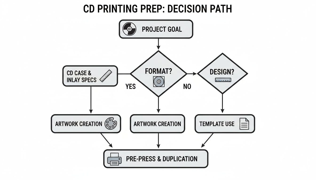
As you can see, locking in your packaging format is the first domino to fall. Everything from your design layout to your final budget hinges on this choice.
Comparing Common CD Packaging Options
To help you weigh your options, here’s a quick side-by-side breakdown of the big three. Think about what matters most for this specific release—is it cost, durability, or making a huge artistic splash?
| Packaging Type | Average Cost (per 100 units) | Durability | Customization Level | Best For |
|---|---|---|---|---|
| Jewel Case | $1.50 - $2.50 | High | Moderate | Retail distribution, full-length albums, durability. |
| Digipak | $2.00 - $4.00 | Medium | High | Special editions, concept albums, high-impact art. |
| Cardboard Sleeve | $1.00 - $1.75 | Low | Low | EPs, singles, promos, tight budgets. |
Each format has its place. The key is aligning the packaging with the project itself. A raw, acoustic EP might feel perfect in a simple cardboard sleeve, while an ambitious concept album almost begs for the sprawling canvas of a multi-panel digipak.
From experience, I can tell you the packaging really does become an extension of the album's story. Don't just see it as a container; see it as the first chapter.
Consider your distribution plan, too. If you’re slinging CDs from a merch table after a show, lightweight sleeves or digipaks are a breeze to haul around. But if you’re shipping orders across the country or aiming for placement in record stores, the rugged protection of a jewel case is hard to beat.
The Finishing Touches That Make a Difference
Once you've picked a format, the next decision is the finish. This small detail can dramatically change how your artwork is perceived and how the final product feels in someone's hands.
Gloss Finish: This is that classic, shiny coating you see everywhere. It’s fantastic for making colors look incredibly vibrant and saturated, so it’s a great choice for photographic covers or artwork with a lot of bright hues. The only real downside? It loves to show off fingerprints and can create a bit of glare.
Matte Finish: A matte finish has no reflection, giving your packaging a smooth, modern, and often more sophisticated feel. It’s amazing for minimalist designs, darker color palettes, and anything with a textured look. It feels soft to the touch and elegantly resists smudges.
These days, sustainability is also a huge conversation in the printing world. More and more printers are offering eco-friendly choices like 100% recycled paper stocks and vegetable-based inks. This isn’t just a trend; it's a response to what people care about. In fact, research shows 89% of marketers believe sustainable practices positively impact how people see their brand. Offering an eco-conscious product can be a powerful way to connect with your audience. You can get a better sense of where things are heading by reading about the evolving printing industry on KeyCompanies.com.
Ultimately, it all comes down to finding that sweet spot between your artistic vision, your budget, and the practical needs of your release. Take your time with these decisions, and you'll end up with a physical product that you're truly proud of.
Preparing Flawless Artwork for Print
This is where the rubber meets the road—taking the incredible design you’ve perfected on screen and making sure it looks just as good in your fans' hands. Getting your artwork "print-ready" isn't just a technical step; it's the crucial process that prevents costly mistakes and ensures your physical media looks professional.
Everything starts and ends with your printer's official dieline template. Don't think of this as a suggestion—it's the literal blueprint. It shows the exact measurements for every cut, fold, and panel, guaranteeing your jewel case insert or digipak folds up perfectly.
Mastering the Core Print Concepts
Before you drop a single image into your design software, you need to get familiar with three non-negotiable terms: bleed, trim, and safety. I like to think of them as protective force fields for your artwork.
- Trim Line: This is simply the line where the machine will physically cut the paper. It's the final, exact edge of your printed piece.
- Bleed Area: The bleed is your safety net. It’s a small border of your artwork (usually 1/8th of an inch or 3mm) that extends past the trim line. If the cutting blade is off by a hair, this extra bit of image ensures you don't end up with an ugly white sliver along the edge.
- Safety Margin: This is an inner boundary, also about 1/8th of an inch inside the trim line. All your critical content—the band name, song titles, key parts of a photo—must live comfortably inside this zone to avoid getting clipped during trimming.
Trust me, ignoring these guides is the number one reason printers reject files. Always make sure background colors and images stretch all the way to the outer edge of the bleed, while keeping the important stuff tucked inside the safety margin.
Getting Your Colors and Resolution Right
Here's a hard lesson many designers learn: what you see on your glowing screen is not what you get on paper. Screens use the RGB (Red, Green, Blue) color model, which is additive (mixing light). Professional printing presses use the CMYK (Cyan, Magenta, Yellow, Black) model, which is subtractive (mixing ink).
If you design in RGB, that vibrant electric blue might print as a dull, lifeless purple. The only way to avoid this heartbreak is to set your design software to the CMYK color profile from the very beginning.
Resolution is just as critical. For print, you need a resolution of 300 DPI (Dots Per Inch) for your images to look sharp and professional. The 72 DPI standard for web images will look horribly pixelated and blurry when printed.
Key Takeaway: Start every print project with the right foundation: a 300 DPI resolution and a CMYK color profile. Trying to fix these settings later is a recipe for a low-quality, disappointing result.
Working with Templates and Text
Once your technical specs are in order, it's time to build your design within the printer's dieline. Treat that template layer like a sacred guide. Keep it visible as you work so you can see precisely where the folds and cuts will land, but always remember to hide or delete it before exporting your final print file.
Text also needs special handling. For the crispest results, keep your text as vector data. If you have to include it in a flattened image file (like a TIFF), make sure the resolution is high. For tiny text, like liner notes, use 100% K (black) only. Using a "rich black" (a mix of all four CMYK colors) can cause fuzzy, hard-to-read text due to tiny misalignments in the printing plates.
Before you send anything off, do this one simple thing: print a copy at home. The colors will be wrong, but that's not the point. Cut it out and fold it into a physical mockup. You'd be amazed at the typos, weird alignments, and awkward image crops you'll catch that are invisible on a flat screen. This is your final chance to spot a mistake before it's too late.
Ultimately, your artwork is a huge part of your album's appeal. To dig deeper, learn more about why artists should invest in quality cover art on our blog.
Navigating the Printing and Proofing Process
You’ve done the creative work—your design files are polished and ready to go. Now comes the critical moment where your digital vision becomes a tangible product. This is the last stop before production, and getting it right ensures the final result is something you’ll be proud of.
Finding the right printing partner is your first move. I always recommend looking for companies that specialize in media packaging. They just get it—they understand the specific quirks of CD case printing, from hitting dieline folds perfectly to getting tray card specs just right. Do your homework: read their customer reviews, ask for samples of their work, and don't be shy about asking what kind of equipment they use.
The printing world is changing fast, with the global market projected to jump from USD 36.13 billion to USD 60.56 billion over the next ten years. A huge part of that growth is thanks to production inkjet technology, which makes short-run, on-demand jobs much more affordable. This is a game-changer for independent artists. You can now order a small, high-quality batch without being forced into a massive, wasteful order. You can learn more about what's new in printing industry trends on SquareSigns.com.
The Critical Importance of Proofing
Before your printer starts the full run, they'll send you a proof. This is your absolute last chance to catch any mistakes. You’ll usually see two kinds of proofs, and understanding the difference can save you a lot of time, money, and heartache.
- Digital Proof (PDF): This is the most common option. You’ll get a PDF showing how your art is laid out. It’s perfect for checking the layout, confirming all the text is correct, and making sure images are in the right place. Just remember, it is not a reliable way to check color.
- Hard Copy Proof (Physical): This is a real, physical sample printed on the actual stock with the same inks your final run will use. Yes, it costs a bit extra and adds a few days to your timeline, but it's the only way to be 100% certain about how your colors and finish will look in person.
So, when do you need which? For a small run of 100 simple cardboard sleeves, a digital proof is probably fine. But if you’re ordering 1,000 digipaks where a very specific shade of blue is essential to your album's vibe, investing in that hard copy proof will save you from a potentially very expensive, very disappointing surprise.
Expert Tip: When you get your proof, print it out—even if it's a digital PDF. I mean it. Cut and fold it into a little mockup of your case. You will be amazed at how many alignment issues or typos you'll spot that were completely invisible on a flat screen.
Your Quality Assurance Checklist
Once that proof is in your hands, it’s time to play detective. Don't just give it a quick glance. This is your final sign-off, so be ruthless.
Go through this list and check everything meticulously:
- Text and Spelling: Read every single word. Out loud. Check artist names, track listings, thank-you credits, and website URLs. Then, have someone else read it, too. A fresh pair of eyes is invaluable.
- Image Quality: Look closely for any blurriness or pixelation. Make sure your photos are sharp and any intricate graphics are rendered cleanly.
- Layout and Alignment: Is everything inside the safety margins? Is the spine text perfectly centered? Do the panels line up correctly when you fold them?
- Color Accuracy (Hard Copy Proofs): This is the big one for physical proofs. Compare the printed colors to your design files on a color-calibrated monitor. Do the skin tones in photos look right? Is your signature red actually your red?
Placing Your Final Order
Once you've approved the proof, you're on the home stretch. Just be sure to confirm the final order details. Pay close attention to the turnaround time quoted by the printer—that’s just production time and doesn't include shipping. If you’ve got a hard release date, I always suggest building in a buffer of at least a week for potential shipping delays. Trust me, they happen.
Figuring out your order quantity is a bit of an art. Ordering more CDs will drop your per-unit cost significantly, but you don't want to end up with boxes of them collecting dust in your closet. Look at your pre-order numbers and what you typically sell at shows to make an educated guess. For a first release, starting with a conservative run of 100-300 units is usually a smart, safe bet.
Turning Your CDs into Cash
The boxes have arrived. You're staring at stacks of your brand-new, beautifully printed CDs, ready for their new homes. This is the moment your investment in quality packaging starts to pay off. Now, let’s get this tangible piece of your art into the hands of your fans.
A compelling online product listing is your digital storefront, and it's about much more than just a price tag. You need to translate the feeling of holding your album into an experience someone can have through their screen. It all starts with photography that does justice to your hard work.
Make Your Product Listing Pop
Your product photos are your digital handshake. Forget a quick phone snap under a dim lightbulb—you need images that scream quality and show off every detail.
- Go for Natural Light: Find a spot near a window. The soft, even lighting makes colors pop accurately and kills harsh, unflattering shadows.
- Show It All Off: Take shots of everything. The front cover, the back with the tracklist, the spine, and especially the inside panels or booklet. Fans are detail-oriented; they want to see it all before they buy.
- Style a Mockup: Get creative with a flat-lay. Place the CD next to its case, and maybe toss in some related merch like a sticker or a t-shirt to hint at an attractive bundle.
Your product description is where you seal the deal. Don't just list the tracks. Tell the story behind the album. Explain the concept of the artwork. If you opted for a recycled digipak because it mattered to you, share that—your environmentally conscious fans will appreciate it.
Boost Your Sales with Bundles
Selling a standalone CD is good, but bundling is where you really start to see the numbers climb. It's one of the easiest ways to increase the average value of each order. You’re not just selling a disc; you’re offering an exclusive experience.
Try pairing the physical CD with a high-quality digital download (think WAV or FLAC files), a signed poster, or a limited-edition sticker. This approach makes the purchase feel more substantial and gives fans who mostly stream a real reason to buy the physical copy.
A well-crafted bundle turns a simple CD sale into a memorable fan package. It’s about adding value beyond the music itself, creating something collectible that fans will be excited to own and display.
While the days of massive CD sales are behind us, the market for these niche, collectible applications is surprisingly strong. The global market for blank discs and labels was valued at around $500 million in 2025. This isn't about mass consumption anymore; it's about dedicated fan bases who crave special physical editions. This market resilience is a huge opportunity for artists to connect with fans through tangible goods. You can read more on this market's resilience at DataInsightsMarket.com.
Set Up Your Digital Merch Table
Your online store is your 24/7 merch table. To do this right, you need a dedicated home for your music and merch. You can explore finding the best website builder for musicians to create that central hub. A platform like OohYeah is built for exactly this, letting you sell directly to your audience without losing a massive cut to third-party marketplaces.
When you're setting up the product, be crystal clear about shipping costs and how long it will take to get orders out the door. Transparency builds trust. Offer a couple of shipping options and have a clear policy for returns or what happens if an item arrives damaged. It saves a lot of headaches later.
Finally, you have to tell people about it! Promote your new CD across all your channels. Share those professional product photos on Instagram, write about the packaging in your newsletter, and give it a shout-out during your next live stream. Make sure your fans know that buying your CD is one of the absolute best ways to support your work directly. For more ideas on how to make the most of your releases, check out our guide on the best ways to sell music online for emerging artists.
Answering Your Top CD Printing Questions
Even the best-laid plans run into snags, and when it comes to printing CDs, a few common questions pop up time and time again. The process is full of industry jargon and technical specs that can trip up even seasoned artists. Let's clear the air and tackle some of the most frequent questions I hear.
Think of this as your go-to cheat sheet for when you're stuck. We'll cover everything from figuring out your budget to making those critical design choices that make your final product shine.
How Much Will a Small Run of CDs Actually Cost Me?
This is usually the first thing on every artist's mind, and the honest answer is: it really depends. The final price tag is a balancing act between three main things: the type of packaging you pick, how many you order, and any cool special finishes you want to add.
For a typical small run of 100 units, here's a ballpark idea of what you can expect to spend:
- Cardboard Sleeves: These are your most wallet-friendly option, usually running $1.50 to $2.50 per unit. They're perfect for EPs, singles, or promotional giveaways.
- Jewel Cases: The classic choice. You're looking at about $2.00 to $3.50 per unit. They give you that traditional retail look and feel, plus solid protection for the disc.
- Digipaks: The premium option. These can range from $3.00 to $5.00 per unit because they involve more complex printing and assembly.
Here's the most important takeaway: the price per CD drops significantly the more you order. Bumping your order up to 1,000 units can often slash your per-unit cost by almost half. My advice? Always get quotes from at least two or three printers, and make sure you ask about shipping costs upfront to avoid any nasty surprises later.
What's the Single Biggest Mistake to Avoid with My Artwork?
Hands down, the most common and costly mistake is ignoring the printer's template—specifically, the bleed and safety margins. I know it seems like a fussy technical detail, but getting this wrong can completely derail your project.
The dieline template isn't just a suggestion; it's the architectural blueprint for your project. Failing to build your design within its boundaries is the number one cause of printing disasters, leading to reprints and missed deadlines.
Bleed is the area of your design that extends past the final trim line. It's there to ensure you don't get ugly white slivers on the edge if the cutting machine is a fraction of a millimeter off. The safety margin is the opposite—it's an inner border that keeps your crucial text and images from getting chopped off. If you ignore these guides, you risk cutting off a band member's head or having your tracklist crammed uncomfortably against the edge. Always, always download the specific template from your printer and design directly within it.
Should I Go with a Matte or Gloss Finish for My Album?
This one is purely about the vibe you're trying to create. There’s no right or wrong answer, but each finish tells a different story and complements different types of artwork.
A gloss finish is shiny and reflective. It makes colors pop, giving them a rich, saturated look. It’s a great choice for albums with bold, colorful photography or bright, high-contrast designs. The downside? It loves fingerprints and can create a nasty glare under direct light.
On the other hand, a matte finish is non-reflective and has a more subtle, modern, and often "premium" feel. It’s fantastic at resisting smudges and works beautifully for darker, textured, or minimalist artwork. If your album's mood is introspective or artistic, matte is probably your best bet. A good rule of thumb: if the music is loud and energetic, go gloss. If it's more thoughtful, go matte.
Is It Even Worth It to Print CDs Anymore?
Absolutely. While streaming is how most people listen to music, CDs have found a new life as essential, high-margin merch and a tangible collectible for your biggest fans. They represent a direct and meaningful way for your audience to support you financially—often far more than thousands of streams ever could.
Physical media creates a home for your lyrics, credits, and expanded artwork, giving listeners a much deeper connection to your music. At the merch table after a show or on your own website, CDs are still one of the most powerful tools you have to engage with fans and generate real income. When selling them online, it’s vital to improve ecommerce customer experience to make buying from you a seamless and positive process. In the end, a CD isn't just a disc; it's a piece of your story that a fan can hold in their hands and truly own.
With OohYeah, you can set up a beautiful storefront to sell those freshly printed CDs directly to the fans who are eager to support your work. List your products, bundle them with digital downloads, and keep more of the money you earn.