The Ultimate Guide to Album Cover Pixel Size
Master the correct album cover pixel size for Spotify, Apple Music, and vinyl. Our complete guide ensures your artwork meets every platform's specifications.
December 28, 2025
Music Marketplace Advisor
Buying & SellingIf you’re aiming for one size that fits all, the magic number for your album cover is 3000 x 3000 pixels. This creates a perfect 1:1 square aspect ratio and guarantees your artwork looks sharp and professional everywhere, from a tiny phone screen to a massive TV display.
Your Quick Reference Guide to Album Cover Dimensions
For any independent artist getting ready to release music through a distributor like OohYeah, nailing the album cover specs is non-negotiable. Honestly, submitting artwork with the wrong dimensions is one of the top reasons I see releases get delayed or flat-out rejected by digital stores.
Think of your album cover as the first impression. It’s what people see before they even press play. While every streaming service has its own nuances, sticking to the highest standard from the start saves a ton of headaches. By creating your master file at 3000 x 3000 pixels, you ensure you’re meeting the strictest requirements out there. The artwork can then be perfectly downscaled by any service needing a smaller version without losing a bit of quality.
Album Cover Requirements for Major Streaming Platforms
I've put together a quick-lookup table to help you double-check your files before you upload. It breaks down what the major players like Spotify and Apple Music are looking for.
This table covers the essential specs—pixel size, file format, and color mode—which are all equally crucial for a smooth submission. If you're curious about how these digital sizes compare to physical media, checking out a guide on standard printing dimensions and specifications can provide some useful context.
| Platform | Required Pixel Size (Width x Height) | Aspect Ratio | Recommended File Format | Color Mode |
|---|---|---|---|---|
| Spotify | 3000 x 3000 pixels (recommended) | 1:1 | JPG or PNG | sRGB |
| Apple Music | 3000 x 3000 pixels (recommended) | 1:1 | JPG or PNG | sRGB |
| Amazon Music | 3000 x 3000 pixels (recommended) | 1:1 | JPG or PNG | RGB |
| Tidal | 1500 x 1500 pixels (minimum) | 1:1 | JPG | RGB |
| Bandcamp | 1400 x 1400 pixels (minimum) | 1:1 | JPG, GIF, or PNG | sRGB |
As you can see, aiming for that 3000 x 3000 pixels target covers nearly all your bases, making it the safest and most efficient choice. Always export as a high-quality JPG or PNG in the sRGB color space unless a platform specifically requests something different.
From Physical Inches to Digital Pixels
Once upon a time, album art was something you could hold in your hands. The conversation wasn't about pixels, but about physical inches—a format that defined visual storytelling in music for decades. The entire point was to design something that would grab a fan's eye from across a crowded record store, making them walk over, pick it up, and get curious about the music inside.
This whole idea dates back to the late 1940s. Alex Steinweiss, working for Columbia Records, cooked up the modern album cover as we know it, setting the standard at a very precise 12.375 × 12.375 inches to perfectly fit a 12-inch vinyl record. Legend has it his first illustrated cover sent sales through the roof, proving that artwork was more than just packaging—it was a powerful part of the music itself. You can find more on the history of music packaging over at Music Gateway's blog.
From Record Shelves to Digital Screens
The jump from physical records to digital streaming completely changed how we experience album art. The big, beautiful canvas of a vinyl sleeve, with all its room for tiny details and liner notes, has been squeezed into a tiny thumbnail on a screen. Often, it's just a few hundred pixels wide.
This shift means your album cover has to pull double duty. The pixel dimensions need to be large enough to look sharp and clean on a huge HD monitor, but the design must also stay clear and powerful when it's shrunk down for a mobile playlist. The tangible act of holding a record is gone, replaced by the need for an image that can fight for attention in a sea of other thumbnails. Your digital cover is now that eye-catching record on the shelf.
"A great album cover in the streaming era must do two things at once: capture the listener's attention in a split second on a crowded screen and scale perfectly from a tiny thumbnail to a full-screen display. The right pixel dimensions are the foundation for achieving both."
This quick graphic breaks down the key specs that have become the industry standard.
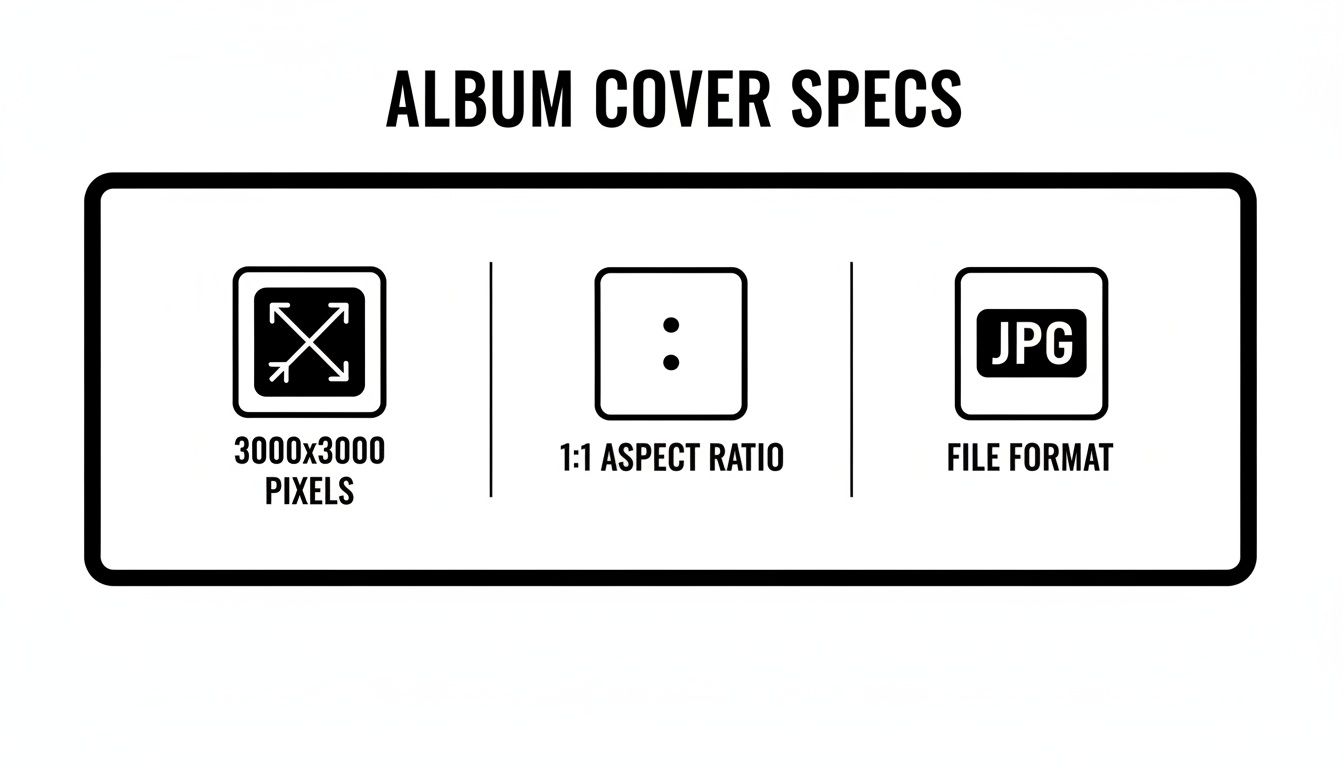
These three elements are your new best friends: a high-resolution 3000x3000 pixel image, a perfect 1:1 square ratio, and the universal JPG format. Nail these, and your art will look flawless everywhere it appears.
Why High-Resolution Pixels Matter Now
In today's world, high resolution isn't just a nice-to-have; it's the baseline for looking professional. A blurry, pixelated cover screams amateur and can subtly affect how a potential fan perceives your music before they even press play. Think about it—if the art looks rushed, what does that say about the audio?
The effort you put into top-notch artwork is directly connected to how listeners engage with your release. You can learn more about this in our guide on why artists should invest in quality cover art.
When you get right down to it, the fundamental rule that pioneers like Steinweiss discovered still holds true. Great visuals sell music, whether you're measuring them in inches or pixels.
Your Guide to Digital Artwork Specs
Every streaming service and digital store has its own rulebook for artwork. It can feel like a moving target, but getting it right the first time is one of the easiest ways to avoid release day headaches. While a high-quality 3000 x 3000 pixel file is your golden ticket for most platforms, the devil is truly in the details.
Think of this as your pre-flight checklist before you send your next masterpiece out into the world with a distributor like OohYeah. We'll break down the exact requirements for the major players so your artwork shows up looking sharp and professional, everywhere.
Spotify Artwork Requirements
As the giant in the room, Spotify's standards are pretty much the industry benchmark. Nail these, and you're in good shape for most other services.
- Recommended Pixel Size: Go with 3000 x 3000 pixels. This is the best way to ensure your art looks flawless, whether it's a tiny thumbnail on a playlist or full-screen on a 4K display.
- Minimum Pixel Size: The absolute floor is 640 x 640 pixels. Honestly, don't even consider it. Uploading at this size is asking for a blurry, unprofessional look on modern screens.
- File Format & Size: Stick to JPG or PNG files and keep the total size under 4MB.
- Color Space: Always export using the sRGB color profile. This prevents weird color shifts and ensures what you see is what your listeners get.
Spotify is also very particular about what can't be on your cover. Keep it clean: no website URLs, social media handles, or any text that even hints at pricing.
Apple Music and iTunes Store Specs
Apple has always curated a premium experience, and their artwork guidelines reflect that. They are notoriously strict, and there's no wiggle room here.
To get your music onto Apple Music and into the iTunes Store, you must follow these rules precisely:
- Pixel Dimensions: They require a minimum of 3000 x 3000 pixels. No exceptions.
- Aspect Ratio: It has to be a perfect 1:1 square. Any other shape will get automatically rejected.
- Resolution: Your artwork needs to be at least 72 DPI.
- File Format: High-quality JPG or PNG files only.
- Color Space: The sRGB color profile is mandatory.
Just like Spotify, Apple will reject any artwork that includes promotional text, web links, or logos from other stores.
In the old days, album art lived on a 12.375-inch vinyl sleeve. Today, it lives in a world of pixels where specs are non-negotiable for getting your music on OohYeah and out to the world. For the bands and managers we work with, we’ve found that a clean RGB JPG at 72+ DPI passes every store's validation. Distributor reports show that blurry or improperly formatted art gets rejected nearly 30% of the time, so don't let a simple file export derail your launch.
Amazon Music, Tidal, and Bandcamp
While Spotify and Apple get most of the attention, you can't forget about the other key platforms. Each has slightly different requirements you'll want to be aware of.
| Platform | Minimum Pixel Size | Recommended File Format | Key Content Rules |
|---|---|---|---|
| Amazon Music | 1600 x 1600 pixels | JPG, PNG | No pricing, URLs, or explicit content. |
| Tidal | 1500 x 1500 pixels | JPG | Must be high quality; no pixelation. |
| Bandcamp | 1400 x 1400 pixels | JPG, GIF, PNG | More lenient, but high-res is still best. |
Getting your album art right is a big piece of the puzzle, but a consistent brand image is just as important. Make sure your other online assets, like your Facebook Cover Size Dimensions, are just as polished. To learn more about the specific features and audiences of these services, dive into our complete guide to different music platforms.
Preparing Artwork for Physical Formats
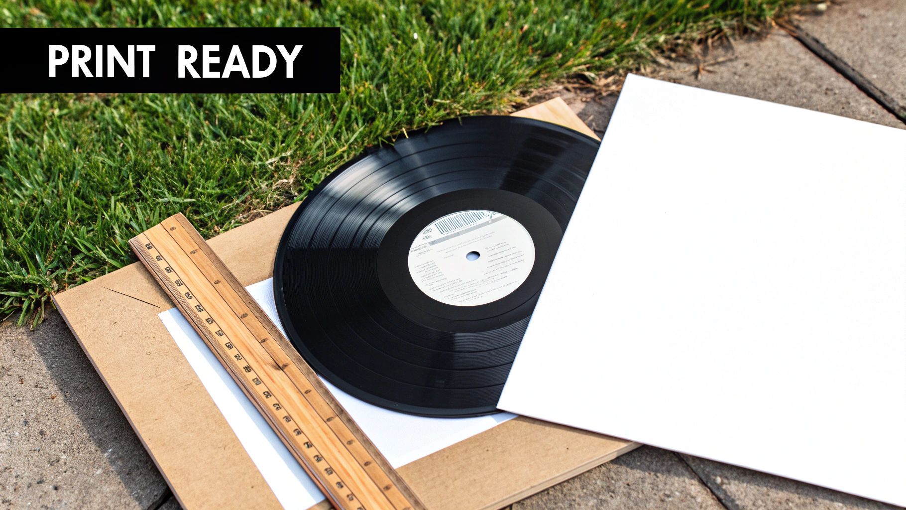
While streaming is king, nothing beats the feeling of holding a physical record. For many artists, CDs and vinyl are more than just merch; they're a vital revenue stream and a tangible connection with fans. But getting your album cover ready for print is a whole different ballgame than prepping it for Spotify. To get a professional result, you need to follow a specific set of rules.
The biggest shift is in resolution and color. Screens are fine with 72 DPI (dots per inch), but for a sharp, high-quality print, you absolutely must provide artwork at 300 DPI. Anything less than that, and you'll end up with a blurry, pixelated mess that looks amateurish and will disappoint everyone who bought it.
Understanding CMYK vs. RGB Color Modes
Another critical difference is the color mode. Your computer screen uses RGB (Red, Green, Blue) light to create the colors you see. Printers, on the other hand, use CMYK (Cyan, Magenta, Yellow, Key/Black) ink.
If you send an RGB file to a professional printer, their software will have to convert it, and the results can be unpredictable—often dull and disappointing. To ensure your colors look the way you intended, you have to convert the files to CMYK yourself before submitting them. This isn't an optional step; it's essential for getting vibrant, accurate colors on your final product.
Essential Printing Concepts: Bleed, Trim, and Safe Area
When you're designing for print, you have to remember that a physical machine will be cutting the paper. These machines aren't perfect, which is why a few key concepts are absolutely non-negotiable for getting a professional result.
- Trim Line: This is the final size of your product where it will be cut. For a standard CD jewel case insert, this is typically 4.75 x 4.75 inches.
- Bleed Area: Think of this as a safety margin. It's an extra bit of your design (usually 0.125 inches or 3mm) that extends past the trim line. If the cutting blade is a tiny bit off, this bleed ensures you don't end up with an ugly white sliver along the edge of your art.
- Safe Area: This is an inner margin, also usually 0.125 inches inside the trim line. All your important stuff—like text, logos, or key parts of an image—needs to stay inside this zone to guarantee it doesn't get chopped off.
"Forgetting to add bleed is one of the most common mistakes new artists make when preparing artwork for print. That small 0.125-inch margin is the difference between a professional-looking vinyl sleeve and one that looks like a misprint."
Messing up your bleed and safe areas can ruin an entire print job, which is a costly and time-consuming mistake. The best move is to always get a design template directly from your manufacturer. They’ll give you the precise dimensions you need, including the bleed, taking all the guesswork out of it. Following their specs is the surest way to make sure your physical media looks as incredible as your music sounds.
Getting Your Export Settings and File Formats Right
Designing a killer album cover is one thing, but exporting it correctly is what actually gets your music on the platforms. If you get these final steps wrong, you risk having your artwork rejected by distributors like OohYeah and all the major streaming services.
This is the final hurdle where I see so many artists stumble, and it leads to some seriously frustrating delays. A simple mistake with the file format, color space, or compression can get your otherwise perfect artwork flagged. Let’s break down the technical side so you get it right every single time.
Choosing the Right File Format
For digital distribution, you're really only dealing with two file formats for your cover art: JPG and PNG. They're both widely accepted, but for album covers, one is clearly the winner.
- JPG (or JPEG): This is the undisputed industry standard. JPGs use what's called "lossy" compression, which is just a technical way of saying they create small file sizes. This is crucial because distributors often have a strict upload limit, sometimes as low as 4MB. When you save a JPG at its highest quality, the tiny bit of data loss is practically invisible, giving you the best of both worlds: great quality and a manageable size.
- PNG: This format uses "lossless" compression, so no quality is lost, but the trade-off is a much larger file. PNGs are fantastic for graphics with sharp, flat colors or when you need a transparent background. But since your album art is likely a photo or a detailed illustration, a JPG is almost always the more practical choice.
Bottom line: Always export your final artwork as a JPG, saved at the highest possible quality setting (100% or 12). This will keep the distributors happy and make sure your art looks crisp.
Nailing Color Profiles and Compression
Okay, so you've chosen JPG. You're not done yet. Two other settings are absolutely critical: the color profile and the compression level. Mess these up, and your cover could look dull, discolored, or blurry when it goes live.
The one and only color profile you should be using is sRGB. It's the universal standard for anything displayed on a screen. Your design software might default to something else (like CMYK, which is for print), so you have to manually set your export to sRGB. If you don't, those vibrant reds in your design might show up as a muddy orange, and the deep blues could look washed out.
When you go to export your JPG, you'll see a quality slider. Don't be tempted to drag it down to save a few kilobytes. Crank that thing all the way to the maximum. Lowering the quality introduces "compression artifacts"—those ugly, blurry patches and pixelated edges that are a classic reason for artwork rejection.
Think of it like this: your album cover pixel size is the canvas, but your export settings are the final protective varnish. They seal in the quality and ensure your work looks exactly how you designed it. To be extra safe, make sure you embed the sRGB color profile directly into the file during the export process. It's usually just a checkbox, but it's a small step that prevents big headaches with color-matching down the line.
Common Artwork Submission Mistakes to Avoid
Getting your music ready for release with a distributor like OohYeah is a huge milestone. The last thing you want is a simple artwork hiccup to derail the whole process. I've seen it happen time and time again—a tiny, preventable error brings everything to a grinding halt.
Let's walk through the most common mistakes so you can get your release out to the world without any frustrating delays. Most of these boil down to misunderstanding the basic album cover pixel size and quality rules.
Low Resolution and Pixelation
This is, without a doubt, the number one reason for rejection. An artist grabs a small image from somewhere online and tries to stretch it to meet the 3000 x 3000 pixel requirement. This technique, known as upscaling, doesn't magically add new detail. It just makes the existing pixels bigger, leaving you with a blurry, pixelated mess.
The golden rule is to always start your design with high-resolution source files. If the image looks fuzzy on your own screen, you can bet it will look even worse on a high-definition display. Distributors use automated systems that will flag blurry artwork in an instant, so there's really no way to slip a low-quality file past them.
Including Prohibited Information
Streaming platforms are incredibly strict about what you can and can't put on your cover art. Think of your artwork as a pure representation of your music, not a billboard. Including any of the following is a surefire way to get your cover rejected on the spot:
- Website URLs or social media handles: Any mention of
.comaddresses or tags like@yourbandnameis completely off-limits. - Pricing information or store logos: You can't include references to retailers like iTunes, Amazon Music, or any other digital store.
- Contact information: This should be obvious, but email addresses and phone numbers are strictly forbidden.
Keep it simple. The only text on your cover should be the artist's name and the title of the release. Anything else is considered advertising and will get flagged immediately.
Your album cover's one job is to represent the music inside. Adding external links or promotional text violates the terms of service for just about every major streaming platform and is a classic rookie mistake.
Incorrect Color Modes and File Types
Here's a more technical but equally critical error: submitting a file in the wrong color mode. Digital screens—from phones to laptops—display colors using the RGB (Red, Green, Blue) color space. Professional printing, on the other hand, uses CMYK (Cyan, Magenta, Yellow, Black).
If you send a CMYK file for digital distribution, the colors can look washed out, dull, or just plain weird on services like Spotify. Always, always export your final digital artwork in the sRGB color space to ensure your colors pop exactly as you intended across all devices. Forgetting this is one of the many mistakes artists make in selling music that are surprisingly easy to avoid. And while you're at it, stick to high-quality JPG or PNG files to sidestep any compatibility headaches.
Album Cover Size FAQ
Getting your music out there involves a lot of moving parts, and the technical side of your album art can be a real stumbling block. Nothing's more frustrating than a last-minute rejection from a distributor because of a simple artwork issue.
Here are the answers to the most common questions we see from independent artists. Think of this as your go-to guide for troubleshooting artwork problems and understanding why platforms like OohYeah and the major streaming services have these rules in the place.
What’s the Best “One-Size-Fits-All” Album Cover?
If you're looking for a single spec that works everywhere, aim for 3000 x 3000 pixels. This is the gold standard that will keep you covered across the board, from Spotify to Apple Music.
Going this large ensures you meet the highest resolution requirements out there. It also means that platforms with lower minimums can scale your image down without it looking fuzzy or distorted. To nail your submission, stick to a perfect 1:1 square aspect ratio, save it as a high-quality JPG, and make sure it’s in the sRGB color space with at least 72 DPI.
Why Did My Cover Get Rejected for Being Blurry?
Blurry or pixelated artwork is a super common reason for rejection, and it usually boils down to one of two things. First, the original image was too small to begin with. If you take a low-resolution photo and stretch it to meet the 3000 x 3000 pixel minimum, it’s going to look pixelated every time.
The other culprit is over-compression. When you save a file as a JPG, you have quality settings. Choosing a low-quality setting to shrink the file size introduces ugly visual artifacts and makes the whole thing look fuzzy. Always start with a high-resolution source image and export your final JPG at the highest quality setting your software offers.
Can I Put My Website or Socials on the Cover?
Nope. This is a hard-and-fast rule across almost every digital store and streaming service. You absolutely cannot include URLs, social media handles, email addresses, or any other kind of contact info on your cover art.
The platforms want the artwork to be a pure representation of the music, free from marketing clutter. That also means no references to physical packaging (like "CD version"), store names, or prices. Stick to the essentials: your artist name and the release title. Adding anything else is one of the quickest ways to get your artwork automatically flagged and rejected.
A good rule of thumb for cover art text is simple: if it’s not the artist's name or the release's title, it probably doesn’t belong. The goal is a clean, professional look that lets the music do the talking.
Do I Need a Different File for CD and Vinyl?
Yes, you definitely need a completely separate file prepared for physical formats. The world of print has entirely different rules than the world of digital screens.
For starters, your digital art needs to be in RGB color mode, which is made for screens that produce light. For print, you have to use CMYK color mode, which is designed for printers that lay down ink. You’ll also need to factor in "bleed"—an extra margin of artwork around the edges that gets trimmed off during production to ensure there are no white borders.
- For Digital: A 3000 x 3000 pixel JPG in sRGB color space at 72 DPI is what you need.
- For Print: Your manufacturer will need a high-resolution (300 DPI) PDF or TIFF file in CMYK color space, built from their template with proper bleed and trim marks included.
Ready to get your music out there without the technical headaches? With OohYeah, uploading your tracks and artwork is straightforward because we’ve built our platform to make distribution as smooth as possible. Get started today and share your sound with the world. Visit us at https://oohyeah.app to learn more.